Action blocks

Stylistic block layout for displaying actionable icon and text. Part of the Bolt “Components” CSS framework that powers the Bolt Design System.

Install via NPM
npm install @bolt/components-action-blocks

Description

Action blocks work as a group to provide the user an easy to browse list of options of relativeto take action to discover more information. They commonly exist as links to more detailed content.

Best Practices

  • Can use xlight, light, dark, and xdark themes.
  • Can have an image, icon, and/or text
  • Should link to content
  • Should be limited to 7 (soft limit) unless we're representing a large list of content that is meant to be scanned
  • Can wrap to many rows
  • Top aligned by default
  • Can be vertically centered
  • Are set with a border by default
  • Can be borderless
  {% include "@bolt-components-action-blocks/action-blocks.twig" with {
  contentItems: [
    {
      text: "Item 1",
      url: "#!",
      icon: {
        name: "icon-name",
        size: "large",
        background: "circle"
      }
    },
    {
      text: "Item 2",
      url: "#!",
      icon: {
        name: "icon-name",
        size: "large",
        background: "circle"
      }
    },
    {
      text: "Item 3",
      url: "#!",
      icon: {
        name: "icon-name",
        size: "large",
        background: "circle"
      }
    }
  ]
} only %}
Name Type Value(s) Description Default
attributes object

A Drupal-style attributes object with extra attributes to append to this component.

N/A
maxItemsPerRow number
- [2 ~ 12]

Number of items to place in a row before beginning a new row.

3
align string
  • top, center, bottom

Alignment of action block content.

top
border boolean
  • TRUE OR FALSE

Display a border around the action blocks.

true
contentItems array
  • [items]:
    • Type: object
    • Properties:
      • text
        • Type: string
      • url
        • Type: string
      • icon
        • Type: object
        • Properties:
          • name
          • size
          • background

Content items to populate the action blocks.

N/A

Action Blocks inside a xlight themed container

Action Blocks inside a light themed container

Action Blocks inside a dark themed container

Action Blocks inside a xdark themed container

Bolt Background

Background can be added to any container. Part of the Bolt “Components” CSS framework that powers the Bolt Design System.

Install via NPM
npm install @bolt/components-background

Description

Background allows Bolt to set an image inside of bands.

  • Can set an image inside the band
  • Can set background shapes
  • Can set focus on the left
  • Can set focus on the right
  • Can set light, medium, or heavy opacity
  • Can set a left, right, or center gradient

We recommend a max-width of 2880px for full-bleed background images. This recommendation takes into consideration the common HD screen resolution of 1920x1080 and multiplies 1920 by 1.5.

  {% include "@bolt-components-background/background.twig" with {
  opacity: "heavy",
  fill: "gradient",
  focalPoint: {
    vertical: "center",
    horizontal: "center"
  },
  contentItems: [
    {
      pattern: "image",
      src: "/images/content/backgrounds/background-tall-4.jpg"
    }
  ]
} only %}
Name Type Value(s) Description Default
attributes object

A Drupal-style attributes object with extra attributes to append to this component.

N/A
opacity string
  • light, medium, heavy

Overlay opacity

medium
overlay string
  • enabled OR disabled

Should an overlay be used for this background.

enabled
shapeGroup string
  • A, B, none

Add a Bolt Background Shapes group.

N/A
shapeAlignment string
  • left OR right

Alignment of shape group.

right
fill string
  • color OR gradient

Type of fill to use for the overlay.

N/A
focalPoint object
    • horizontal

      Currently only reverses gradient on 'left'.

      • center, left, right
    • vertical

      Currently doesn't use this value. Intended future application.

      • center, top, bottom

Where the opacity background should originate.

N/A
contentItems array
  • [items]:
    • Type: object
    • Properties:

An array of objects to place in the background.

N/A

Light Opacity

Visualization & Simulation

Imagine the Future with Decision Hub

Continuously improve results by visualizing how future adjustments to your strategies can impact business performance. Simulate and test your ideas, evaluate the results using intuitive views, and then deploy optimal alterations.

Medium Opacity

Visualization & Simulation

Imagine the Future with Decision Hub

Continuously improve results by visualizing how future adjustments to your strategies can impact business performance. Simulate and test your ideas, evaluate the results using intuitive views, and then deploy optimal alterations.

Heavy Opacity

Visualization & Simulation

Imagine the Future with Decision Hub

Continuously improve results by visualizing how future adjustments to your strategies can impact business performance. Simulate and test your ideas, evaluate the results using intuitive views, and then deploy optimal alterations.

Heavy Opacity with Left Focal Point

Visualization & Simulation

Imagine the Future with Decision Hub

Continuously improve results by visualizing how future adjustments to your strategies can impact business performance. Simulate and test your ideas, evaluate the results using intuitive views, and then deploy optimal alterations.

Heavy Opacity with Right Focal Point

Visualization & Simulation

Imagine the Future with Decision Hub

Continuously improve results by visualizing how future adjustments to your strategies can impact business performance. Simulate and test your ideas, evaluate the results using intuitive views, and then deploy optimal alterations.

Background Shapes: Shape Group A

circle-square
Outline Circle
square-square
Little Circle
square-square
Little Circle

Visualization & Simulation

Imagine the Future with Decision Hub

Continuously improve results by visualizing how future adjustments to your strategies can impact business performance. Simulate and test your ideas, evaluate the results using intuitive views, and then deploy optimal alterations.

Background Shapes: Shape Group B

square-square
Outline Circle
square-square
Little Circle
circle-circle
Outline Circle

Visualization & Simulation

Imagine the Future with Decision Hub

Continuously improve results by visualizing how future adjustments to your strategies can impact business performance. Simulate and test your ideas, evaluate the results using intuitive views, and then deploy optimal alterations.

Background Shapes: Shape Group A, Alignment Left

circle-square
Outline Circle
square-square
Little Circle
square-square
Little Circle

Visualization & Simulation

Imagine the Future with Decision Hub

Continuously improve results by visualizing how future adjustments to your strategies can impact business performance. Simulate and test your ideas, evaluate the results using intuitive views, and then deploy optimal alterations.

Fill: Color

Visualization & Simulation

Imagine the Future with Decision Hub

Continuously improve results by visualizing how future adjustments to your strategies can impact business performance. Simulate and test your ideas, evaluate the results using intuitive views, and then deploy optimal alterations.

Fill: Gradient

Visualization & Simulation

Imagine the Future with Decision Hub

Continuously improve results by visualizing how future adjustments to your strategies can impact business performance. Simulate and test your ideas, evaluate the results using intuitive views, and then deploy optimal alterations.

Visualization & Simulation

Imagine the Future with Decision Hub

Continuously improve results by visualizing how future adjustments to your strategies can impact business performance. Simulate and test your ideas, evaluate the results using intuitive views, and then deploy optimal alterations.

Background shapes

A grid of colored vector shapes for use in backgrounds. Part of the Bolt “Components” CSS framework that powers the Bolt Design System. This component will likely not be used on its own, but rather will be a dependency of another component that includes it.

Install via NPM
npm install @bolt/components-background-shapes

Description

Background shapes bring the brand further into Bolt. These shapes create a background texture for bands. The shapes are offset at an angle offset inside a band component.

Best Practices

  • Set to the right side of the band if there is copy on the left.
  • Set to the left side of the band if there is copy on the right.
  • Shapes can be used behind cards or thumbnail images (video or just image) but should not make the content hard to consume by the user.
  • Shapes should not be used behind any text elements. Doing so makes the text hard to read.
  • Don't use background shapes if it makes the content in the band hard to parse
  {% include "@bolt-components-background-shapes/background-shapes.twig" with {
  shapeGroup: "B"
} only %}
Name Type Value(s) Description Default
shapeGroup string
  • A OR B

The shapeGroup to use to build the shapes layout.

A
square-square
Outline Circle
square-square
Little Circle
circle-circle
Outline Circle

shapeGroup: A

circle-square
Outline Circle
square-square
Little Circle
square-square
Little Circle

shapeGroup: B

square-square
Outline Circle
square-square
Little Circle
circle-circle
Outline Circle

Band

Band is a general content container with spacing and background options. Part of the Bolt Design System.

Install via NPM
npm install @bolt/components-band
  {% include "@bolt-components-band/band.twig" with {
  content: "This is a band.",
} only %}
Name Type Value(s) Description Default
attributes object

A Drupal-style attributes object with extra attributes to append to this component.

N/A
content string OR array OR object

Main content of the band.

N/A
pinned_content object
    • upper

      Pinned to the upper area of the band.

        • content

          A pinned area can contain 1 or more items.

        • align

          Horizontal alignment of a single item.

          • start, center, end
    • lower

      Pinned to the lower area of the band.

        • content

          A pinned area can contain 1 or more items.

        • align

          Horizontal alignment of a single item.

          • start, center, end

Pinned content of the band.

N/A
tag string
  • div, article, section, header, footer, nav, figure

Controls the semantic HTML tag to use for the band's content.

div
size string
  • none, xsmall, small, medium, large

Controls the vertical spacing of the band.

medium
full_bleed boolean

If set to true, the band will take the full width of the page.

true
theme string
  • none, xlight, light, dark, xdark

Controls the theme of the band.

dark
row_gutter

DEPRECATED

Please use pinned_content. Instructions on how to use pinned_content is on the Band with Pinned Content demo page.

N/A
content_row_start

DEPRECATED

Please use pinned_content. Instructions on how to use pinned_content is on the Band with Pinned Content demo page.

N/A
items

DEPRECATED

Please use content and pinned_content. Instructions on how to use pinned_content is on the Band with Pinned Content demo page.

N/A
fullBleed

DEPRECATED

This prop has been renamed. Please use full_bleed.

N/A
contentTag

DEPRECATED

This prop is no longer needed. tag takes care of the semantic markup automatically.

N/A

band

This is a band.
This is a band with size set to none.
This is a band with size set to xsmall.
This is a band with size set to small.
This is a band with size set to medium.
This is a band with size set to large.
This is a band with theme set to none.
This is a band with theme set to xlight.
This is a band with theme set to light.
This is a band with theme set to dark.
This is a band with theme set to xdark.

Each pinned area (upper and lower) can have 1 or more items, spacing will be evenly distributed

upper pinned 1
upper pinned 2
upper pinned 3

This Is a Headline

This Is a Subheadline

lower pinned 1
lower pinned 2
lower pinned 3

This Is a Headline

This Is a Subheadline

When there is only 1 item, you can set the align prop to your liking (start, center, end)

This Is a Headline

This Is a Subheadline

Note: please convert the deprecated items prop to the new pinned_content prop.

Deprecated items prop usage

  {% include "@bolt-components-band/band.twig" with {
  content: content,
  items: [
    {
      position: {
        align: "end",
        valign: "center",
        row_start: 1,
        column_start: 1,
        column_end: 12,
      },
      content: pinned_share,
    },
  ]
} only %}

New pinned_content prop usage

  {% include "@bolt-components-band/band.twig" with {
  content: content,
  pinned_content: {
    upper: [
      {
        content: pinned_share,
        align: "end",
      },
    ],
  }
} only %}

This Band Has a Backround Image

This Band Has a Backround Video

This Band Has 2 Bands Nested Inside

Nested band 1
Nested band 2

This Is a Flag

With text on the left and CTAs on the right.

This Is an Eyebrow

This Is a Headline

This Is a Subheadline

This is a paragraph.

Image descriptionImage description

Collection 1

Image descriptionImage description

Collection 2

Image descriptionImage description

Collection 3

Block List

Block list for stacked full-width content. Part of the Bolt “Components” CSS framework that powers the Bolt Design System.

Install via NPM
npm install @bolt/components-block-list
  {% include "@bolt-components-block-list/block-list.twig" with {
  items: [
    include("@bolt-components-link/link.twig", {
      text: "Link 1",
      url: "#!",
      icon: {
        name: "chevron-right",
        position: "before"
      }
    }),
    include("@bolt-components-link/link.twig", {
      text: "Link 2",
      url: "#!",
      icon: {
        name: "chevron-right",
        position: "before"
      }
    }),
    include("@bolt-components-link/link.twig", {
      text: "Link 3",
      url: "#!",
      icon: {
        name: "chevron-right",
        position: "before"
      }
    }),
    "Simple text example"
  ]
} only %}
Name Type Value(s) Description Default
attributes object

A Drupal-style attributes object with extra attributes to append to this component.

N/A
items array

The content items

All of the items in the block list - can have simple text or items

N/A

Theme: xlight


Theme: light


Theme: medium


Theme: dark


Theme: xdark


Blockquote

Stylistic pull quote styles for all types of layout. Part of the Bolt “Components” CSS framework that powers the Bolt Design System.

Install via NPM
npm install @bolt/components-blockquote

Description

Block quotes provide testimonials throughout the pega experience.

Content that can be contained in a blockquote

  • Logo or image (optional)
  • Quote
  • Attributor image (optional)
  • Attributor name (optional)
  • Attributor title (optional)
  • Attributor company (optional)

Additional info

  • Can be full width or confined with the grid
  • Can be left, center, or right aligned
  • can have top+bottom horizontal lines, a left or right vertical line, or no lines
  • Text is open sans
  • Quote marks are NOT inch marks
  • Quote marks are system font Georgia
  • Text color changes based on the theme colors
  {% include "@bolt-components-blockquote/blockquote.twig" with {
  content: "

The greater danger for most of us lies not in ... achieving our mark.

" } only %}
Name Type Value(s) Description Default
attributes object

A Drupal-style attributes object with extra attributes to append to this component.

N/A
content* string

Text to appear in blockquote (Twig only). May be plain text or text wrapped in

<

p> tags.

N/A
size string
  • large, xlarge, xxlarge

Text size.

xlarge
alignItems string
  • left, center, right

Aligns items left, center, or right.

left
border string
  • vertical, horizontal, none

Add a border.

vertical
indent boolean

Indent text.

false
fullBleed boolean

Width of the brower window.

false
logo object
  • @bolt-components-logo/logo.schema.yml > Object details
    • invert

      Set to true to invert the logo colors.


      Type: boolean

Add a logo component.

N/A
author object
    • name

      Author's name.

    • title

      Author's title.

    • image
      • @bolt-components-image/image.schema.yml > Object details
        • attributes

          A Drupal-style attributes object with extra attributes to append to this component.


          Type: object
        • src

          Source url for image.


          Type: string
        • alt

          Alt tag for image.


          Type: string
        • lazyload

          Lazyload can boost performance by loading images on demand, instead of on initial page load.


          Type: boolean
          • TRUE OR FALSE
        • no_lazy

          Override the default lazyload behavior. Used only on the web component, where the presence of a boolean property always equates to true.


          Type: boolean
          • TRUE OR FALSE
        • placeholder_color

          A valid CSS background color property shown while image loads.


          Type: string
        • placeholder_image

          Image path or image data shown while image loads.


          Type: string
        • srcset

          A comma seperated string of image urls and image widths, used for optimizing image loading performance.


          Type: string
        • sizes

          A list of one or more strings separated by commas indicating a set of source sizes. Each source size consists of a media condition (omitted for the last item), and a source size value. Learn more.


          Type: string
        • useAspectRatio

          DEPRECATED

          Use the ratio prop instead.


          Type: boolean
          • TRUE OR FALSE
        • ratio

          boolean option is DEPRECATED

          Set the aspect ratio for the image via slash-separated width and height values, e.g. 4/3. Currently required for aspect ratio to be applied properly. Set to "none" to opt out of aspect ratio.


          Type: string OR boolean
        • width

          DEPRECATED

          Override the default width of the image. If no height is provided, aspect ratio will be maintained.


          Type:
        • height

          DEPRECATED

          Override the default height of the image. If no width is provided, aspect ratio will be maintained.


          Type:
        • cover

          Set an image to fill its container.


          Type: boolean
          • TRUE OR FALSE
        • imageAttributes

          DEPRECATED

          A Drupal-style attributes object with extra attributes to append to this component.


          Type: object

Author of the quote.

N/A

The greater danger for most of us lies not in setting our aim too high and falling short; but in setting our aim too low, and achieving our mark.

Michelangelo di Lodovico Buonarroti Simoni Renaissance Artist

alignItems: left

The greater danger for most of us lies not in setting our aim too high and falling short; but in setting our aim too low, and achieving our mark.

Michelangelo di Lodovico Buonarroti Simoni Renaissance Artist

alignItems: center

The greater danger for most of us lies not in setting our aim too high and falling short; but in setting our aim too low, and achieving our mark.

Michelangelo di Lodovico Buonarroti Simoni Renaissance Artist

alignItems: right

The greater danger for most of us lies not in setting our aim too high and falling short; but in setting our aim too low, and achieving our mark.

Michelangelo di Lodovico Buonarroti Simoni Renaissance Artist

Indent: True

The greater danger for most of us lies not in setting our aim too high and falling short; but in setting our aim too low, and achieving our mark.

Michelangelo di Lodovico Buonarroti Simoni Renaissance Artist

Indent: False

The greater danger for most of us lies not in setting our aim too high and falling short; but in setting our aim too low, and achieving our mark.

Michelangelo di Lodovico Buonarroti Simoni Renaissance Artist

Border: vertical

The greater danger for most of us lies not in setting our aim too high and falling short; but in setting our aim too low, and achieving our mark.

Michelangelo di Lodovico Buonarroti Simoni Renaissance Artist

Border: horizontal

The greater danger for most of us lies not in setting our aim too high and falling short; but in setting our aim too low, and achieving our mark.

Michelangelo di Lodovico Buonarroti Simoni Renaissance Artist

Border: none

The greater danger for most of us lies not in setting our aim too high and falling short; but in setting our aim too low, and achieving our mark.

Michelangelo di Lodovico Buonarroti Simoni Renaissance Artist

Multiple Paragraph Content

Blockquote can have one paragraph. In pellentesque faucibus vestibulum. Nulla at nulla justo, eget luctus tortor. Nulla facilisi. Duis aliquet egestas purus.

Or it can have multiple paragraphs. Mauris iaculis porttitor posuere. Praesent id metus massa, ut blandit odio. Proin quis tortor orci. Etiam at risus et justo dignissim congue. Donec congue lacinia dui, a porttitor lectus condimentum laoreet. Nunc eu ullamcorper orci.

Mike Mai Pegasystems

theme: xlight

The greater danger for most of us lies not in setting our aim too high and falling short; but in setting our aim too low, and achieving our mark.

Michelangelo di Lodovico Buonarroti Simoni Renaissance Artist

theme: light

The greater danger for most of us lies not in setting our aim too high and falling short; but in setting our aim too low, and achieving our mark.

Michelangelo di Lodovico Buonarroti Simoni Renaissance Artist

theme: dark

The greater danger for most of us lies not in setting our aim too high and falling short; but in setting our aim too low, and achieving our mark.

Michelangelo di Lodovico Buonarroti Simoni Renaissance Artist

theme: xdark

The greater danger for most of us lies not in setting our aim too high and falling short; but in setting our aim too low, and achieving our mark.

Michelangelo di Lodovico Buonarroti Simoni Renaissance Artist
Web Component Usage Bolt Link is a web component that renders a semantic blockquote with Bolt styles. For a simple blockquote, wrap your quote content in the <bolt-blockquote> custom element. Note: you must wrap your quote text in <p> tags for the appropriate quotation marks to appear. Add attribution to the quote by adding the author-name, author-title, and author-image attributes to <bolt-blockquote>.

The greater danger for most of us lies not in setting our aim too high and falling short; but in setting our aim too low, and achieving our mark.

<bolt-blockquote author-name="Michelangelo di Lodovico Buonarroti Simoni" author-title="Renaissance Artist" author-image="/images/placeholders/500x500.jpg"> <p>The greater danger for most of us lies not in setting our aim too high and falling short; but in setting our aim too low, and achieving our mark.</p> </bolt-blockquote>
Additional Options Apply additional configuration options via attributes on the <bolt-blockquote> element. Attribute names and values match the Twig schema but use "kebab-case" instead of "camelCase". For example, alignItems becomes align-items.

The greater danger for most of us lies not in setting our aim too high and falling short; but in setting our aim too low, and achieving our mark.

<bolt-blockquote align-items="center" border="horizontal" author-name="Michelangelo di Lodovico Buonarroti Simoni" author-title="Renaissance Artist" author-image="/images/placeholders/500x500.jpg"> <p>The greater danger for most of us lies not in setting our aim too high and falling short; but in setting our aim too low, and achieving our mark.</p> </bolt-blockquote>
Advanced Usage To add a logo to <bolt-blockquote> place logo content (for example: <bolt-logo> or <img>) next to blockquote text, and add the attribute slot="logo" to the logo's outermost container.
PayPal Logo

The greater danger for most of us lies not in setting our aim too high and falling short...

In fact, the greater danger is setting our aim too low and achieving our mark.

<bolt-blockquote author-name="Michelangelo di Lodovico Buonarroti Simoni" author-title="Renaissance Artist" author-image="/images/placeholders/500x500.jpg"> <img slot="logo" src="/images/content/logos/logo-paypal.svg" alt="PayPal Logo"> <p>The greater danger for most of us lies not in setting our aim too high and falling short...</p> <p>In fact, the greater danger is setting our aim too low and achieving our mark.</p> </bolt-blockquote>

Breadcrumb

Stylistic pull quote styles for all types of layout. Part of the Bolt “Components” CSS framework that powers the Bolt Design System.

Install via NPM
npm install @bolt/components-breadcrumb
  {% include "@bolt-components-breadcrumb/breadcrumb.twig" with {
  contentItems: [
    include("@bolt-components-link/link.twig", {
      text: "Home",
      url: "#!"
    }),
    include("@bolt-components-link/link.twig", {
      text: "Landing Page",
      url: "#!"
    }),
    include("@bolt-components-link/link.twig", {
      text: "Sub Page",
      url: "#!"
    }),
    "Current Page"
  ]
} only %}
Name Type Value(s) Description Default
attributes object

A Drupal-style attributes object with extra attributes to append to this component.

N/A
contentItems array

Breadcrumb pieces.

N/A

Breadcrumb Component in a Band ^

The above example shows a xsmall band containing the breadcrumbs.

Eyebrow

Headline

Subheadline

Body text.

Breadcrumb Band Stacking On Top of Featured Band ^

The above example shows a small band containing the breadcrumbs and large band containing the content. Both have theme set to none.

Background and Theming

There is an outer band containing the breadcrumb band and the featured band, background and theme should be set on that outer band.

Digital Transformation

Be Future Empowered

Start with the outcomes you want.

Digital transformation is more than a slick new mobile app. It demands the hard work of designing for customer outcomes. Pega software gives you the power to truly transform.

Breadcrumb Band Stacking On Top of Featured Band with Outer Background Band ^

The above example shows a small band containing the breadcrumbs and large band containing the content. Both have theme set to none.

Background and Theming

A background image is set on the outer band and the theme is set to dark.

Digital Transformation

Be Future Empowered

Start with the outcomes you want.

Digital transformation is more than a slick new mobile app. It demands the hard work of designing for customer outcomes. Pega software gives you the power to truly transform.

Breadcrumb Band Stacking On Top of Featured Band (individually themed)^

The above example shows a xsmall band containing the breadcrumbs and large band containing the content.

Background and Theming

No background or theme is set on the outer band in this case because it's not neccessary.

Bolt Button

Buttons are the core of our action components.

Bolt's Component Explorer is being upgraded. It'll return in a future release!

Button is a branded component to convey call to action. Part of the Bolt “Components” CSS framework that powers the Bolt Design System.

Install via NPM
npm install @bolt/components-button

Description

Buttons are the core of our action components. Their affordance is immediate and can be use for most actions and allow users to access the target with a single interaction. Buttons clearly provide a next step for the user.

Our Buttons depend on the theme they are contained in and change in appearance based on said theme. The themes and button colors were designed together to ensure the proper amount affordance and clarity.

Xlight and light themes

  • Primary: Light Indigo container with white text
  • Secondary: white button with indigo text
  • Text button: Light indigo text with chevron

Dark and xdark themes

  • Primary: Yellow container with default indigo text
  • Secondary: white button with indigo text
  • Text button: white text with chevron

  • Currently only have one defined size (though other options can and will be defined in the future)

  • Can be 100% width of the wrapper for mobile or card instances
  • Can optionally be 100% width. For example, the button has default width of 2 rem on either side on larger screens but full width on smaller screens

Dos

  • CTAs must be clearly and succinctly labeled with a next step
  • CTA should lead with strong action verbs
  • The primary CTA should be the most important action.
  • Be consistent in placement based on the screen size and device
  • Fall back to the text button in secondary and tertiary content areas where you can. For example, cards with a button use the text style so that a filled button doesn't become overwhelming and redundant.
  • Follow theming rules

Don'ts

  • Don't clutter the page with too many buttons
  • Don't mix and match themes and their button colors. For example, do not use the indigo button on dark and xdark themes as the indigo button does not stand out enough.
  • Don't mix and match colors outside the theme, see button groups.
  {% include "@bolt-components-button/button.twig" with {
  text: "This is a button"
} only %}

Buttons are the core of our action components.

Name Type Value(s) Description Default
attributes object

A Drupal-style attributes object with extra attributes to append to this component.

N/A
text* string

Text inside the button.

N/A
transform string
  • uppercase, lowercase, capitalize, none

Transforms the button text to various cases.

none
tag string
  • a, link, button, submit, reset

Determines the semantic HTML tag for the button.

button
size string
  • xsmall, small, medium, large, xlarge

Size of the button.

medium
style string
  • primary, secondary, text

Style of the button determined by information hierarchy.

primary
width string
  • auto, full, full@small

Controls the width of the button.

auto
border_radius string
  • regular OR full

Rounds the corners of the button.

regular
align string
  • start, center, end

Horizontal alignment of items (text and icon) inside the button. Note: the values left and right are deprecated, use start and end instead.

center
icon object
  • @bolt-components-icon/icon.schema.yml > Object details
    • attributes

      A Drupal-style attributes object with extra attributes to append to this component.


      Type: object
    • name

      Icon name.


      Type: string
      • academy, add-open, add-solid, agile, app-development, app-exchange, arrow-left, asset-data, asset-infographic, asset-interactive, asset-link, asset-media, asset-podcast, asset-presentation, asset-text, asset-video, bolt-logo-colored, brand-operations, calendar, careers, case-management, check, check-circle, check-solid, chevron-down, chevron-left, chevron-right, chevron-up, close, close-open, close-solid, cloud, co-browse, communications, copy-to-clipboard, customer-decision-hub, customer-onboarding, customer-service, data-integrations, documentation, download, email, energy, entertainment, exit-full-screen, external-link, eye, eye-off, facebook, facebook-solid, field-service, field-service-gray, filter, financial, full-screen, github, global, government, healthcare, hospitality, industries, info-open, info-solid, insurance, integration, intelligent-virtual-assistant, java, knowledgebase, launchpad, life-sciences, linkedin, linkedin-solid, lock, manufacturing, map-pin, map-pin-solid, marketing, marketing-gray, menu, minus-open, minus-solid, mobility, more, omni-channel, partners, pencil, platform, podcast, print, product, product-delivery, refresh, reporting, retail, robo-auto, sales-automation, scalability, search, share, star-solid, support, system-admin, training, transportation, twitter, twitter-solid, unlock, upload, user, user-interface, video, vision, warning, watch, workforce-intelligence, youtube-solid
    • background

      Background shape. This applies only to 'xlarge' icons.


      Type: string
      • circle OR square
    • size

      Icon size.


      Type: string
      • small, medium, large, xlarge
    • color

      Icon color. Currently only support default (black) and teal.


      Type: string
      • teal OR blue

Icon data as expected by the icon component. Accepts an additional position prop that determines placement within the button.

N/A
iconOnly boolean

Make the button to display only the icon and hide the text (which is still required). You are required to pass both text and icon data for this option to work.

false
itemAlignment

DEPRECATED

Use the align parameter instead.

N/A
rounded

DEPRECATED

Use the border_radius parameter instead.

N/A

Note: medium is the default size.

Note: interactive states only appear when the user interacts with the button, they are not styles that are available for use.

Regular States

Interactive States

Buttons inside a xdark theme

Buttons inside a dark theme

Buttons inside a light theme

Buttons inside a xlight theme

Note: full@small means that the button will go from auto width to full width when the browser goes below the small breakpoint.

Note: the align prop only works with full width buttons.

This button's tag is defined as: a

This button's tag is defined as: link

Note: when passing icons inside a button, it is required to define the icon's position, by default it is set to after, which means the icon will come after the text.

Icon position set to before

Icon position set to after

Note: an icon-only button still is still required to have text, and that text is accessible through screen readers. It's just visually hidden.

Xsmall icon-only button

Small icon-only button

Medium icon-only button

Large icon-only button

Xlarge icon-only button

Full border radius (circle icon-only button)

Examples with different icons

Add a js- target class for the button to perform something through javascript

Web Component Usage Bolt Button is a web component, you can simply use <bolt-button> in the markup to make it render.
This is a button
<bolt-button url="https://pega.com"> This is a button </bolt-button>
Basic Usage To use icon in combination with text within the button, you must pass <bolt-icon> with a slot attribute defined as either before or after. Note: the slot attribute is required in order for the icon to be placed and spaced correctly within the button. Even if icon-only option is turned on, slot is still required.

This is a button

This is a button

This is a button

<p> <bolt-button> <bolt-icon name="chevron-left" slot="before"></bolt-icon> This is a button </bolt-button> </p> <p> <bolt-button> <bolt-icon name="chevron-right" slot="after"></bolt-icon> This is a button </bolt-button> </p> <p> <bolt-button icon-only> <bolt-icon name="close" slot="before"></bolt-icon> This is a button </bolt-button> </p>
Advanced Usage The web component has all the options shown in the schema table. You can define each prop within the <bolt-button> element. Use unique combinations to customize a button to your liking. Note: the style prop is named color instead.
This is a button
<bolt-button url="https://pega.com" size="large" color="secondary" border-radius="full" tag="a" icon-only > <bolt-icon name="menu" slot="before"></bolt-icon> This is a button </bolt-button>
Server-side Rendered Web Components (Experimental) The <bolt-button> component, among many other web components in Bolt, will support server-side rendering via the new upcoming {% filter bolt_ssr %} custom Twig filter. Check out the docs on server-side rendering for information!
This is a button
<bolt-button> This is a button <bolt-icon name="chevron-right" slot="after"></bolt-icon> </bolt-button>

Button Group

Button-group can contain multiple buttons. Part of the Bolt “Components” CSS framework that powers the Bolt Design System.

Install via NPM
npm install @bolt/components-button-group

Description

Button groups are a horizontal set of actions with a hierarchy that defines the spacing and their relationship between each other. This set of actions help people under stand their options with potential next steps.

Button padding left is 1rem when there are multiple buttons in a horizontal row.

Dos

  • Follow the button component guidelnes
  • Separate buttons by 1rem
  • Make sure the CTAs have a relationship with each other. If they don't reevaluate the content structure.
  • Be sure to consider the horizontal group of actions in smaller, less optimal sizes.
  • Be sure to determine the hierarchy of the CTAs in the group. These patterns are good:
    • Primary + secondary + text button
    • Secondary + text button
    • Primary + text button

Don'ts

  • Don't have multiple primary buttons grouped together
  • Don't have LESS than 1rem separating buttons
  • Don't have MORE than 1rem separating buttons
  • Don't have CTAs grouped together that do not relate to one another.

NOTE: We currently do not have joined buttons (eg, no gap, single button with two sides), but this is something to consider moving forward.

  {% include "@bolt-components-button-group/button-group.twig" with {
  buttons: [
    {
      text: "Learn More",
      style: "primary"
    },
    {
      text: "About Pega",
      style: "secondary"
    }
  ]
} only %}
Name Type Value(s) Description Default
tag string
  • ul OR ol

Html tag to wrap the button group.

N/A
buttons array
  • [items]:
    • Type: object

      Bolt button information.

    • Properties:

An array of button objects.

N/A
contentItems array
  • [items]:
    • Type: object

      Bolt component information.

    • Properties:

Content items.

An array of bolt objects.

N/A
content string

A string of content to place in the button group.

N/A

1 Button(s)

2 Button(s)

3 Button(s)

4 Button(s)

5 Button(s)

This is text with the tags stripped.

Card

Install via NPM
npm install @bolt/components-card

Description

The preview card presents users as a way of taking action to discover more information. They commonly exist as links to more detailed long-form content, links off-site, and occasionally inline videos.

Best Practices

  • Placement should be in a manner where it is easily scannable
  • The headline should call out what the benefit is of clicking through
  • Avoid cluttering a card with too many calls to action
  • If the headline can work as link affordance without a button, don't have a button
  • If the headline does not clearly invoke action, use a CTA at the bottom of the card to entice the user
  {% include "@bolt-components-card/card.twig" with {
  tag: "article",
  contentItems: [
    {
      pattern: "image",
      src: "/images/sample/anthem-video.jpg",
      alt: "Anthem Video"
    },
    {
      pattern: "eyebrow",
      text: "Video"
    },
    {
      pattern: "headline",
      tag: "h3",
      size: "large",
      text: "Anthem: Service Desktop"
    },
    {
      pattern: "text",
      text: "Anthem debuts its next-generation service desktop, driving frictionless customer experiences."
    },
    {
      pattern: "button",
      width: "full",
      text: "Get the report"
    }
  ]
} only %}
Name Type Value(s) Description Default
tag string
  • div, article, section, figure

Html tag immediately within the bolt-card element.

N/A
contentTag string
  • div, article, section, figcaption

Html tag immediately within the bolt-card element.

N/A
theme string
  • xlight, light, dark, xdark

Bolt theme.

N/A
url string

Providing a URL will make the entire card link to another resource. This is a future prop and does not do anything right now.

N/A

card

Anthem VideoAnthem Video

Video

Anthem: Service Desktop

Anthem debuts its next-generation service desktop, driving frictionless customer experiences.
Anthem VideoAnthem Video

Video

Anthem: Service Desktop

Anthem debuts its next-generation service desktop, driving frictionless customer experiences.

Video

Video Meta Title Goes Here.

Anthem debuts its next-generation service desktop, driving frictionless customer experiences.
Anthem VideoAnthem Video

Body text. Vestibulum ante ipsum primis in faucibus orci luctus et ultrices posuere cubilia Curae; Proin vel ante a orci tempus eleifend ut et magna. Lorem ipsum dolor sit amet, consectetur adipiscing elit.

Cards in a band

Anthem VideoAnthem Video

Eyebrow

Headline

Body text. Anthem debuts its next-generation service desktop, driving frictionless customer experiences.
Anthem VideoAnthem Video

Remove Eyebrow and Button

Anthem debuts its next-generation service desktop, driving frictionless customer experiences.

Remove Image, Eyebrow, and Button

Anthem debuts its next-generation service desktop, driving frictionless customer experiences.

Individual themed cards in a band

Anthem VideoAnthem Video

Video

Anthem: Service Desktop

Anthem debuts its next-generation service desktop, driving frictionless customer experiences.
Anthem VideoAnthem Video

Video

Anthem: Service Desktop

Anthem debuts its next-generation service desktop, driving frictionless customer experiences.
Anthem VideoAnthem Video

Video

Anthem: Service Desktop

Anthem debuts its next-generation service desktop, driving frictionless customer experiences.

Individual themed cards in a band w/ background image

Anthem VideoAnthem Video

Video

Anthem: Service Desktop

Anthem debuts its next-generation service desktop, driving frictionless customer experiences.
Anthem VideoAnthem Video

Video

Anthem: Service Desktop

Anthem debuts its next-generation service desktop, driving frictionless customer experiences.
Anthem VideoAnthem Video

Video

Anthem: Service Desktop

Anthem debuts its next-generation service desktop, driving frictionless customer experiences.

Non-themed cards in a band w/ background image

Anthem VideoAnthem Video

Video

Anthem: Service Desktop

Anthem debuts its next-generation service desktop, driving frictionless customer experiences.
Anthem VideoAnthem Video

Video

Anthem: Service Desktop

Anthem debuts its next-generation service desktop, driving frictionless customer experiences.
Anthem VideoAnthem Video

Video

Anthem: Service Desktop

Anthem debuts its next-generation service desktop, driving frictionless customer experiences.

Personalized card test, client-rendered, with a large delay

Before:

Anthem VideoAnthem Video

Video

Personalized card, client-rendered, with a large delay (before)

Anthem debuts its next-generation service desktop, driving frictionless customer experiences.

After:

Anthem VideoAnthem Video

Video

Personalized card, client-rendered, with a large delay (after)

Anthem debuts its next-generation service desktop, driving frictionless customer experiences.

Personalized card test, client-rendered, with a small delay

Before:

Anthem VideoAnthem Video

Video

Personalized card, client-rendered, with a small delay (before)

Anthem debuts its next-generation service desktop, driving frictionless customer experiences.

After:

Anthem VideoAnthem Video

Video

Personalized card, client-rendered, with a small delay (after)

Anthem debuts its next-generation service desktop, driving frictionless customer experiences.

Personalized card test, client-rendered, without a delay

Before:

Anthem VideoAnthem Video

Video

Personalized card, client-rendered, without a delay (before)

Anthem debuts its next-generation service desktop, driving frictionless customer experiences.

After:

Anthem VideoAnthem Video

Video

Personalized card, client-rendered, without a delay (after)

Anthem debuts its next-generation service desktop, driving frictionless customer experiences.

Personalized card test, server-rendered, with a large delay

Before:

Anthem VideoAnthem Video

Video

Personalized card, server-rendered, w/ a large delay (before)

Anthem debuts its next-generation service desktop, driving frictionless customer experiences.

After:

Anthem VideoAnthem Video

Video

Personalized card, server-rendered, w/ a large delay (after)

Anthem debuts its next-generation service desktop, driving frictionless customer experiences.

Personalized card test, server-rendered, with a small delay

Before:

Anthem VideoAnthem Video

Video

Personalized card, server-rendered, w/ a small delay (before)

Anthem debuts its next-generation service desktop, driving frictionless customer experiences.

After:

Anthem VideoAnthem Video

Video

Personalized card, server-rendered, w/ a small delay (after)

Anthem debuts its next-generation service desktop, driving frictionless customer experiences.

Personalized card test, server-rendered, without delay

Before:

Anthem VideoAnthem Video

Video

Personalized card, server-rendered, without a delay (before)

Anthem debuts its next-generation service desktop, driving frictionless customer experiences.

After:

Anthem VideoAnthem Video

Video

Personalized card, server-rendered, without a delay (after)

Anthem debuts its next-generation service desktop, driving frictionless customer experiences.

Chip

Stylistic tags for displaying meta data. Part of the Bolt “Components” CSS framework that powers the Bolt Design System.

Install via NPM
npm install @bolt/components-chip
  {% include "@bolt-components-chip/chip.twig" with {
  text: "This is a chip",
  url: "#!",
} only %}
Name Type Value(s) Description Default
attributes object

A Drupal-style attributes object with extra attributes to append to this component.

N/A
text string

Chip Text.

N/A
url string

Optional. When url is present, tag changes to a, otherwise tag would be span.

N/A
tag string
  • a OR span

Html tag to be used. If a URL is provided, this will be ignored and a will be always be used.

span

chip

Web Component Usage

Bolt Chip is a web component, you can simply use <bolt-chip> in the markup to make it render.

Example

<bolt-chip>
  Text of the chip
</bolt-chip>

Simple usage

Text of the chip

Passing url

Chip with link

Chip List

Chip-list can contain multiple chips. Part of the Bolt “Components” CSS framework that powers the Bolt Design System.

Install via NPM
npm install @bolt/components-chip-list
  {% include "@bolt-components-chip-list/chip-list.twig" with {
  items: [
    {
      text: "Chip 1",
      url: "#!"
    },
    {
      text: "Chip 2",
      url: "#!"
    },
    {
      text: "Chip 3",
      url: "#!"
    }
  ]
} only %}
Name Type Value(s) Description Default
items array
  • [items]:
    • Type: object

      Chip.

    • Properties:

An array of Chips.

N/A
contentItems array
  • [items]:
    • Type: object

      Chip.

    • Properties:

DEPRECATED

Deprecated (will be removed in Bolt v3.0) - use the items prop instead.

N/A

Chip list with links

Chip list with text

  • Do not include any data or information in your posts that are confidential!
  • Apply basic practices for collaborative work.
  • Be honest, respectful, trustworthy and helpful.
  • Answer questions authoritatively and concisely. Avoid cluttering discussions with noise.

Code Snippet

Monospace Font Styles for Code Text

Code snippet shows text in a style that is best fit for a monospace font. Part of the Bolt “Components” CSS framework that powers the Bolt Design System.

Install via NPM
npm install @bolt/components-code-snippet
  {% include "@bolt-components-code-snippet/code-snippet.twig" with {
  display: "block",
  lang: "html",
  content: "Some code snippet"
} only %}

Monospace Font Styles for Code Text

Name Type Value(s) Description Default
display string
  • block OR inline

Display

Defines if the code text is inline or block.

block
lang string
  • css, html, js, scss, twig

Language

Language of the code text.

html
syntax string
  • light, dark, none

Syntax Highlighting

Toggle between a light and dark syntax highlighting, or turn it off. Separate from Bolt theming.

light

Code snippet can be a block of code, and display is set to block by default.

  display: block;
margin: 0 0 1.65rem 0;

Well, code snippet can also be inline like this display:inline; when you set display to be inline instead.

block:


Headline

inline:

Headline

css:

  .my-css {
  display: block;
}

scss:

  .my-scss {
  @include my-mixin;
}

html:


Headline

javascript:

  import { polyfillLoader } from '@bolt/core';

twig:

  {% include "@bolt-components-code-snippet/code-snippet.twig" with {
  display: "block",
  lang: "html",
  content: "Some code snippet"
} only %}

light:


Headline

dark:


Headline

none:


Headline

Copy to Clipboard

Copy to Clipboard allows the user to copy the current page URL to clipbaord to paste and share.

Install via NPM
npm install @bolt/components-copy-to-clipboard
  {% include "@bolt-components-copy-to-clipboard/copy-to-clipboard.twig" with {
  text_to_copy: "https://boltdesignsystem.com"
} only %}
Name Type Value(s) Description Default
attributes object

A Drupal-style attributes object with extra attributes to append to this component.

N/A
text string

DEPRECATED

This property has been renamed trigger_text

Copy Link
copiedText string

DEPRECATED

Use the custom_confirmation property instead if you need to change the confirmation text.

Copied!
iconSize string

DEPRECATED

Use custom_trigger, custom_transition, and custom_confirmation properties if you need to change icon size.

medium
url string

DEPRECATED

This property has been renamed text_to_copy

N/A
trigger_text string

Text to use for the inital copy button. Ignored if the custom_trigger property is used.

Copy Link
text_to_copy* string

The text to copy to the clipboard.

N/A
custom_trigger string OR object OR array

(optional) Custom content to show for the initial copy trigger. If you pass a link, set the URL to '#!' since it should not being followed.

N/A
custom_transition string OR object OR array

(optional) Custom content to show while copy is in progress. This content will be rotated while the copying happens, so it's recommended to pass an icon.

N/A
custom_confirmation string OR object OR array

(optional) Custom content to show after a successful copy.

N/A
Copied!
Copied!
Copied!
Copied!
Custom transition
Copied!
Copied!
Custom transition

Custom confirmation

Device Viewer

Device frames for showcase. Part of the Bolt “Components” CSS framework that powers the Bolt Design System.

Install via NPM
npm install @bolt/components-device-viewer
  {% include "@bolt-components-device-viewer/device-viewer.twig" with {
  device: "iphone8",
  orientation: "portrait",
  color: "white",
  image: {
    src: "/images/sample/product-device-screenshot--phone.jpg"
  }
} only %}
Name Type Value(s) Description Default
deviceName string
  • ipad, iphone8, macbook

Name of the device.

N/A
color string
  • black, silver, gold

Device color.

N/A
orientation string
  • portrait OR landscape

Device orientation.

N/A
magnify boolean

Add the magnifier effect.

false
image object
    • src

      Source url for the image.

N/A

Color: black
Orientation: 'portrait'

Color: black
Orientation: 'landscape'

Color: silver
Orientation: 'portrait'

Color: silver
Orientation: 'landscape'

Magnification: true
Orientation: 'portrait'

Magnification: true
Orientation: 'landscape'

Color: black
Orientation: 'portrait'

Color: black
Orientation: 'landscape'

Color: silver
Orientation: 'portrait'

Color: silver
Orientation: 'landscape'

Color: gold
Orientation: 'portrait'

Color: gold
Orientation: 'landscape'

Magnification: true
Orientation: 'portrait'

Magnification: true
Orientation: 'landscape'

Magnification: true

Dropdown

The Dropdown component adds a slick, extensible, and accessible menu system.

Install via NPM
npm install @bolt/components-dropdown

Description

Fully interactive with and without JS enabled (including keyboard support)

  // Via Twig
{% embed "@bolt-components-dropdown/dropdown.twig" with {
  title: "Toggle Menu",
  collapse: true
} %}
  {% block content %}
    {% include "@bolt-components-nav/nav.twig" with {
      links: [
        {
        text: "Link 1 Text",
        url": "#!"
      },
      {
        text: "Link 2 Text",
        url": "#!"
      },
      {
        text: "Link 3 Text",
        url": "#!"
      }
      ]
    } %}
  {% endblock %}
{% endembed %}

// Via Web Component and Twig

  {% include "@bolt-components-nav/nav.twig" with {
    links: [
      {
        text: "Link 1 Text",
        url": "#!"
      },
      {
        text: "Link 2 Text",
        url": "#!"
      },
      {
        text: "Link 3 Text",
        url": "#!"
      }
    ]
  } only %}

Name Type Value(s) Description Default
title string

The toggle title text

N/A
center boolean

True to center the toggle title

false
collapse boolean

True to hide toggle until mobile screen size

false
content any

All of the items in the dropdown -- generally works by including @bolt-components-nav/nav.twig with links array of objects containing text & url

N/A

Figure

Figure for displaying graphics or tabular content. Part of the Bolt “Components” CSS framework that powers the Bolt Design System.

Install via NPM
npm install @bolt/components-figure
  {% include "@bolt-components-figure/figure.twig" with {
  media: {
    image: {
      src: "/images/placeholders/500x500.jpg",
      lazyload: false
    },
  },
  caption: "Figure caption."
} only %}
Name Type Value(s) Description Default
attributes object

A Drupal-style attributes object with extra attributes to append to this component.

N/A
media object
    • image

      A Bolt image object.

      • @bolt-components-image/image.schema.yml > Object details
        • attributes

          A Drupal-style attributes object with extra attributes to append to this component.


          Type: object
        • src

          Source url for image.


          Type: string
        • alt

          Alt tag for image.


          Type: string
        • lazyload

          Lazyload can boost performance by loading images on demand, instead of on initial page load.


          Type: boolean
          • TRUE OR FALSE
        • no_lazy

          Override the default lazyload behavior. Used only on the web component, where the presence of a boolean property always equates to true.


          Type: boolean
          • TRUE OR FALSE
        • placeholder_color

          A valid CSS background color property shown while image loads.


          Type: string
        • placeholder_image

          Image path or image data shown while image loads.


          Type: string
        • srcset

          A comma seperated string of image urls and image widths, used for optimizing image loading performance.


          Type: string
        • sizes

          A list of one or more strings separated by commas indicating a set of source sizes. Each source size consists of a media condition (omitted for the last item), and a source size value. Learn more.


          Type: string
        • useAspectRatio

          DEPRECATED

          Use the ratio prop instead.


          Type: boolean
          • TRUE OR FALSE
        • ratio

          boolean option is DEPRECATED

          Set the aspect ratio for the image via slash-separated width and height values, e.g. 4/3. Currently required for aspect ratio to be applied properly. Set to "none" to opt out of aspect ratio.


          Type: string OR boolean
        • width

          DEPRECATED

          Override the default width of the image. If no height is provided, aspect ratio will be maintained.


          Type:
        • height

          DEPRECATED

          Override the default height of the image. If no width is provided, aspect ratio will be maintained.


          Type:
        • cover

          Set an image to fill its container.


          Type: boolean
          • TRUE OR FALSE
        • imageAttributes

          DEPRECATED

          A Drupal-style attributes object with extra attributes to append to this component.


          Type: object
    • icon

      A Bolt icon object.

      • @bolt-components-icon/icon.schema.yml > Object details
        • attributes

          A Drupal-style attributes object with extra attributes to append to this component.


          Type: object
        • name

          Icon name.


          Type: string
          • academy, add-open, add-solid, agile, app-development, app-exchange, arrow-left, asset-data, asset-infographic, asset-interactive, asset-link, asset-media, asset-podcast, asset-presentation, asset-text, asset-video, bolt-logo-colored, brand-operations, calendar, careers, case-management, check, check-circle, check-solid, chevron-down, chevron-left, chevron-right, chevron-up, close, close-open, close-solid, cloud, co-browse, communications, copy-to-clipboard, customer-decision-hub, customer-onboarding, customer-service, data-integrations, documentation, download, email, energy, entertainment, exit-full-screen, external-link, eye, eye-off, facebook, facebook-solid, field-service, field-service-gray, filter, financial, full-screen, github, global, government, healthcare, hospitality, industries, info-open, info-solid, insurance, integration, intelligent-virtual-assistant, java, knowledgebase, launchpad, life-sciences, linkedin, linkedin-solid, lock, manufacturing, map-pin, map-pin-solid, marketing, marketing-gray, menu, minus-open, minus-solid, mobility, more, omni-channel, partners, pencil, platform, podcast, print, product, product-delivery, refresh, reporting, retail, robo-auto, sales-automation, scalability, search, share, star-solid, support, system-admin, training, transportation, twitter, twitter-solid, unlock, upload, user, user-interface, video, vision, warning, watch, workforce-intelligence, youtube-solid
        • background

          Background shape. This applies only to 'xlarge' icons.


          Type: string
          • circle OR square
        • size

          Icon size.


          Type: string
          • small, medium, large, xlarge
        • color

          Icon color. Currently only support default (black) and teal.


          Type: string
          • teal OR blue
    • video

      A Bolt video object.

      • @bolt-components-video/video.schema.yml > Object details
        • attributes

          A Drupal-style attributes object with extra attributes to append to this component.


          Type: object
        • videoId

          Brightcove ID for this video.


          Type: string OR number
        • playerId

          Brightcover Player ID.


          Type: string
        • accountID

          ID of the Brightcove account that owns the video.


          Type: string OR number
        • videoUuid

          A unique identifying string, randomly generated if not provided.


          Type: string
        • share_description

          A custom title to use in the share overlay


          Type: string
        • ratio

          Maintain video ratio.


          Type: boolean
        • collapsed

          Should the video be collapsed on load.


          Type: boolean
        • showMeta

          Should the video show meta data.


          Type: boolean
        • showMetaTitle

          Should the video show meta title.


          Type: boolean
        • controls

          Should the video controls be available.


          Type: boolean
        • autoplay

          Should the video auto-play on load.


          Type: boolean
        • loop

          Should the video loop.


          Type: boolean
        • isBackgroundVideo

          Set to true if the video is a background.


          Type: boolean
        • on_init

          The on_init config allows for an external Javascript function inlined on the page to add any 3rd party scripts or video plugins to a <bolt-video> player instance when initializing. Please see the new recommended enabled_plugins and disabled_plugins options below.


          Type: string
        • default_plugins

          An array of the default <bolt-video> player plugins that are globally enabled by default.


          Type: array
          • playback
        • available_plugins

          The built-in <bolt-video> player plugins that are availble to be used in any player instance without requiring the use of any extra Javascript.


          Type: array
          • playback, social, email, cue
        • enabled_plugins

          Space-separated list of built-in <bolt-video> plugins for Brightcove to enable. Current include social, email, playback, and cue. For example: <bolt-video enabled-plugins="cue social email playback">.


          Type: string
        • disabled_plugins

          Space-separated list of any built-in <bolt-video> plugins for Brightcove to disable. Used to opt-out of any video plugins that are enabled by default (ex. the playback plugin). For example: <bolt-video disabled-plugins="playback">.


          Type: string
    • table

      A Bolt table object.

      • @bolt-components-table/table.schema.yml > Object details
        • attributes

          A Drupal-style attributes object with extra attributes to append to this component.


          Type: object
        • headers

          Generates top and side headers, each can contain an array of cells.


          Type: object
            • top
                • cells

                  Each item represents a cell in the top header.

                  • [items]:
                    • Type: any
                    • Properties:
                      • content
                        • Type: string
                      • attributes
                        • Type: object
            • side
                • cells

                  Each item represents a cell in the side header.

                  • [items]:
                    • Type: any
                    • Properties:
                      • content
                        • Type: string
                      • attributes
                        • Type: object
        • rows

          Generates an array of rows, each can contain an array of cells.


          Type: array
            • cells

              Each item represents a cell in a row.

              • [items]:
                • Type: any
                • Properties:
                  • content
                    • Type: string
                  • attributes
                    • Type: object
        • footer

          Generates a table footer, can contain an array of cells.


          Type: object
            • cells

              Each item represents a cell in the footer.

              • [items]:
                • Type: any
                • Properties:
                  • content
                    • Type: string
                  • attributes
                    • Type: object
        • format

          Display either a regular table or a more complex numeric table.


          Type: string
          • regular OR numeric
        • borderless

          Removes the vertical border in between cells.


          Type: boolean
        • first_col_fixed_width

          Sets the width of the first column to be as wide as the longest text.


          Type: boolean

Media accepts either image, icon, video, or table.

N/A
caption string OR object OR array

Caption for the figure.

N/A
content

DEPRECATED.

Figure contains no content. Only media and caption.

N/A
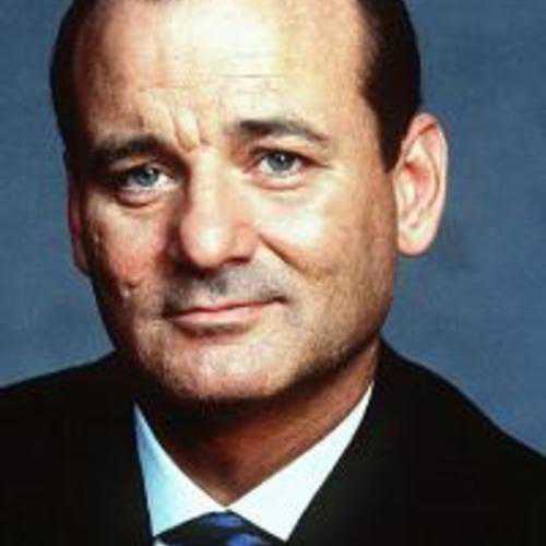
Fig. 1: This is Bill. He is awesome.

Image Figure

Fig. 1: This is an image.

Icon Figure

Fig. 2: This is an icon.

Video Figure

Fig. 3: This is a video.

Table Figure

Column 1 Column 2 Column 3
Row 1 R1C1 R1C2 R1C3
Row 2 R2C1 R2C2 R2C3
Row 3 R3C1 R3C2 R3C3
Footer FC1 FC2 FC3
Fig. 4: This is a table.
Web Component Usage Bolt Figure is a web component. Use the custom element <bolt-figure> to wrap your figure media and caption. The figure media must have the attribute slot="media" or be wrapped by an element with that attribute. Everything else inside the <bolt-figure> tag is considered the caption. We recommend simply using text with optional inline markup (as seen below).
This is a caption. Lorem ipsum dolor sit amet, consectetur adipiscing elit text link.
<bolt-figure> <img src="/images/placeholders/landscape-16x9-mountains.jpg" slot="media" /> This is a caption. Lorem ipsum <em>dolor sit amet</em>, consectetur adipiscing elit <a href="#">text link</a>. </bolt-figure>

Form

A collection of fieldsets to create a form. Part of the Bolt “Components” CSS framework that powers the Bolt Design System.

Install via NPM
npm install @bolt/components-form
  {% include "@bolt-components-form/form.twig" with {
  text: "This is a form",
  url: "#!",
} only %}
Name Type Value(s) Description Default
icon_size

Customize the size of the input icon used

medium
We promise not to sell your email address
The username you entered is already taken.

Select an alignment

Select toppings

If there were any server-side errors, you'd see them here
Pick at least two of the following

Get the Report

(all fields are required)

Get the Report

(all fields are required)

Get the Report

(all fields are required)

Get the Report

(all fields are required)

(Note: forms do not offically support dark themes yet. Use at your own risk.)

Bolt Grid

A flexible 12-column grid with responsive breakpoint options.

A flexible 12-column grid with responsive breakpoint options. Part of the Bolt “Components” CSS framework that powers the Bolt Design System.

Install via NPM
npm install @bolt/components-grid
  {% include "@bolt-components-grid/grid.twig" with {
  gutter: "medium",
  row_gutter: "medium",
  items: [
    {
      column_start: "1",
      column_span: "1",
      row_start: "1",
      row_span: "1",
      valign: "start",
      content: "Item Content",
    },
  ]
} only %}

A flexible 12-column grid with responsive breakpoint options.

Name Type Value(s) Description Default
attributes object

A Drupal-style attributes object with extra attributes to append to this component.

N/A
gutter string
  • none, small, medium, large

Spacing between the columns of the grid.

medium
row_gutter string
  • none, small, medium, large

Spacing between the rows of the grid.

medium
items array
    • attributes

      A Drupal-style attributes object with extra attributes to append to this component.

    • content

      Content to render inside each grid item.

    • valign

      Vertical alignment of the grid item itself.

      • start, center, end
    • column_start

      The vertical starting point of the grid item. This accepts any number from 1 to 12, and their perspective responsive variations for advanced usage, for example, 6@small means the column start is set at 6 for any browser width larger and equal to the small breakpoint. This prop is required to make the grid work in Internet Explorer.

    • column_span

      The number of columns the grid item should span across. This accepts any number from 1 to 12, and their perspective responsive variations for advanced usage, for example, 6@small means the column span is set at 6 for any browser width larger and equal to the small breakpoint.

    • row_start

      The horizontal starting point of the grid item. This prop is required to make the grid work in Internet Explorer.

    • row_span

      The number of rows the grid item should span across.

Array of grid items to render inside the grid.

N/A

grid

Bolt Grid is a 12-column grid design approach

By using The Grid to design layouts, consistency is guaranteed. If your goal is to confine your layout to a 12-column grid and have elements spaced and lined up consistently using the Bolt spacing system, The Grid is for you. Otherwise, you should not use The Grid, there is the List component for simple layouts and alignments.

1 2 3 4 5 6 7 8 9 10 11 12

Support for Internet Explorer: Due to IE's outdated technology, it is mandatory to define column start and row start if you want the grid to render correctly.

Column start and column span

The Bolt Grid is built on the concept of column start and column span, this allows the user to have full control of the grid layout.

Common usage

Main content in the center (column start 3 and column span 8) with 2 asides.

Aside Main Aside

Main content with an aside (column start 9 and column span 4).

Main Aside

Row start and row span

Row start and row span are also available, they are for less common layouts.

Row Row Row Start at column 2 and row 2 and span 2 rows. Row Row Row

All possible start and span options

Please refer to the Bolt Breakpoints for all possible breakpoint names. number@breakpoint-name means starting at that specific breakpoint, change to the number defined. For example: column_span: "6@small" means starting at the small breakpoint, span 6 columns.

Regular Option Responsive Option
column_start 1 to 12 1@breakpoint-name to 12@breakpoint-name
column_span 1 to 12 1@breakpoint-name to 12@breakpoint-name
row_start 1 to 12 1@breakpoint-name to 12@breakpoint-name
row_span 1 to 12 1@breakpoint-name to 12@breakpoint-name

None Gutter

Span 4 columns Span 4 columns Span 4 columns

Small Gutter

Span 4 columns Span 4 columns Span 4 columns

Medium Gutter

Span 4 columns Span 4 columns Span 4 columns

Large Gutter

Span 4 columns Span 4 columns Span 4 columns

None Row Gutter

Span 12 columns Span 12 columns Span 12 columns

Small Row Gutter

Span 12 columns Span 12 columns Span 12 columns

Medium Row Gutter

Span 12 columns Span 12 columns Span 12 columns

Large Row Gutter

Span 12 columns Span 12 columns Span 12 columns

Each item can span from 1 to 12 columns

Span 3 columns Span 6 columns Span 9 columns Span 12 columns

Use any combination that adds up to 12 columns to form a row

In this example, the item 1 is starting at column 1 and spanning 3 columns wide, the item 2 is starting at column 4 and spanning 9 columns.

Item 1 Item 2

In this example, the item 1 is starting at column 1 and spanning 6 columns wide, the item 2 is starting at column 7 and spanning 6 columns.

Item 1 Item 2

Each item can span from 1 to 12 rows

Row span works as long as you have multiple rows. For example, if you only have 2 rows of content, you cannot have an item to span 3 rows because the highest you can get is 2.

3 rows 6 rows 9 rows 12 rows Row Row Row Row Row Row Row Row Row Row Row Row

Responsive breakpoint options

Use the @breakpoint options to do advanced responsive layouts.

  • Item 1
    1. Up to small breakpoint: start at row 2 and span 12 columns
    2. Starting at small breakpoint: start at row 1 and span for 4 columns
    3. Starting at medium breakpoint: start at row 1 and span for 3 columns
    column_start: "1", column_span: "12 3@small 4@medium", row_start: "2 1@small"
  • Item 2
    1. Up to small breakpoint: start at row 1 and span 12 columns
    2. Starting at small breakpoint: start at row 1 and span for 8 columns
    3. Starting at medium breakpoint: start at row 1 and span for 9 columns
    column_start: "1 5@small 4@medium", column_span: "12 8@small 9@medium", row_start: "1 1@small"
Item 1 Item 2

Horizontal item alignment

The alignment must be set manually by using column start and column span, that way the user can position the item exactly as intended with the flexibility doing more than the common start, center, and end alignments.

Standard alignments

To align an item to the start, set column start to 1.

Column start at 1 and span 4

To align an item to the center, set column start by using this formula: (12 - column_span) / 2 + 1.

Column start at 5 and span 4

To align an item to the end, set column start by using this formula: (12 - column_span) + 1.

Column start at 9 and span 4

Advanced alignments

Offset by 1 column from the center.

Column start at 4 and span 8

Offset by 1 column from the start.

Column start at 2 and span 2

Vertical item alignment

Vertical alignment of an item can simply be defined by the valign prop.

Start

Item Item Item

Center

Item Item Item

End

Item Item Item

Traditional Columns and Rows

  1. Use a parent grid to create rows, each item span for 12 columns.
  2. Inside each item of the parent grid, pass a child grid to create columns.
Item Item Item
Item Item Item
Item Item Item

Headline

Headlines are specific combinations of typographic styles for display text. Part of the Bolt “Components” CSS framework that powers the Bolt Design System.

Install via NPM
npm install @bolt/components-headline
  {% include "@bolt-components-headline/headline.twig" with {
  text: "This is a headline",
} only %}

{% include "@bolt-components-headline/eyebrow.twig" with {
  text: "This is an eyebrow",
} only %}

{% include "@bolt-components-headline/subheadline.twig" with {
  text: "This is a subheadline",
} only %}

{% include "@bolt-components-headline/text.twig" with {
  text: "This is text",
} only %}

{% include "@bolt-components-headline/lead.twig" with {
  text: "This is a lead",
} only %}
Name Type Value(s) Description Default
text* string OR object OR array

Renderable text content of the headline.

N/A
tag string
  • h1, h2, h3, h4, h5, h6, p, span, cite, div

Html tag.

p
align string
  • left, center, right

Text alignment.

N/A
weight string
  • bold, regular, semibold

Font weights.

regular
style string
  • normal OR italic

Font styles.

normal
size string
  • xsmall, small, medium, large, xlarge, xxlarge, xxxlarge

Font size.

medium
transform string
  • uppercase, lowercase, capitalize

Text transformation.

N/A
url string

If provided, turns headline into a link to given url.

N/A
icon object OR string OR string

Bolt icon. Accepts either 1) an icon name as a string 2) an icon object as expected by @bolt-components-icon or 3) the string "none" to explicitly remove default icons

N/A
quoted boolean

Adds quoted styling to text.

N/A

This is an eyebrow

This is a headline

This is a subheadline

This is text

This is a lead

H1

This is an example of H1

H2

This is an example of H2

H3

This is an example of H3

H4

This is an example of H4

H5

This is an example of H5

H6

This is an example of H6

P

This is an example of P

SPAN

This is an example of SPAN

Align:

This is an example of align left

Align:

This is an example of align center

Align:

This is an example of align right

This is bold weight and normal text

This is bold weight and normal headline

This is bold weight and normal subheadline

This is bold weight and italic text

This is bold weight and italic headline

This is bold weight and italic subheadline

This is regular weight and normal text

This is regular weight and normal headline

This is regular weight and normal subheadline

This is regular weight and italic text

This is regular weight and italic headline

This is regular weight and italic subheadline

This is semibold weight and normal text

This is semibold weight and normal headline

This is semibold weight and normal subheadline

This is semibold weight and italic text

This is semibold weight and italic headline

This is semibold weight and italic subheadline

Headline w/ Icon Position before

What we do at Pega is brilliant!


Headline w/ Icon Position after

What we do at Pega is brilliant!


Headline w/ Default Icon Position

What we do at Pega is brilliant!


Headline w/ Icon Options

What we do at Pega is brilliant!


Headline w/ Left Icon Position (Deprecated)

What we do at Pega is brilliant!


Headline w/ Right Icon Position (Deprecated)

What we do at Pega is brilliant!

What we do at Pega is brilliant!

Icon

Icon. Part of the Bolt “Components” CSS framework that powers the Bolt Design System.

Install via NPM
npm install @bolt/components-icon
  {% include "@bolt-components-icon/icon.twig" with {
  name: "add-open",
  background: "circle",
  size: "medium",
} only %}
Name Type Value(s) Description Default
attributes object

A Drupal-style attributes object with extra attributes to append to this component.

N/A
name* string
  • academy, add-open, add-solid, agile, app-development, app-exchange, arrow-left, asset-data, asset-infographic, asset-interactive, asset-link, asset-media, asset-podcast, asset-presentation, asset-text, asset-video, bolt-logo-colored, brand-operations, calendar, careers, case-management, check, check-circle, check-solid, chevron-down, chevron-left, chevron-right, chevron-up, close, close-open, close-solid, cloud, co-browse, communications, copy-to-clipboard, customer-decision-hub, customer-onboarding, customer-service, data-integrations, documentation, download, email, energy, entertainment, exit-full-screen, external-link, eye, eye-off, facebook, facebook-solid, field-service, field-service-gray, filter, financial, full-screen, github, global, government, healthcare, hospitality, industries, info-open, info-solid, insurance, integration, intelligent-virtual-assistant, java, knowledgebase, launchpad, life-sciences, linkedin, linkedin-solid, lock, manufacturing, map-pin, map-pin-solid, marketing, marketing-gray, menu, minus-open, minus-solid, mobility, more, omni-channel, partners, pencil, platform, podcast, print, product, product-delivery, refresh, reporting, retail, robo-auto, sales-automation, scalability, search, share, star-solid, support, system-admin, training, transportation, twitter, twitter-solid, unlock, upload, user, user-interface, video, vision, warning, watch, workforce-intelligence, youtube-solid

Icon name.

N/A
background string
  • circle OR square

Background shape. This applies only to 'xlarge' icons.

N/A
size string
  • small, medium, large, xlarge

Icon size.

N/A
color string
  • teal OR blue

Icon color. Currently only support default (black) and teal.

N/A

icon

Bolt's SVG icon system provides the ability to customize an individual icon's color (the shape itself), background color, and background opacity levels, in both the Twig and Custom Element formats the design system ships.

via Web Component:


via Twig Include:

  {% include "@bolt-components-icon/icon.twig" with {
  name: "customer-service",
  background: "circle",
  size: "xlarge",
  attributes: {
    style: [
      "color: #e64b18;",
      "--bolt-theme-icon-background: #e64b18;",
      "--bolt-theme-icon: #FFF;",
      "--bolt-theme-icon-background-opacity: 1;"
    ]
  }
} only %}

Theme: light


  • Background: circle

  • Background: circle
    Color: teal

  • Background: circle
    Color: blue


  • Background: square

  • Background: square
    Color: teal

  • Background: square
    Color: blue

Theme: dark


  • Background: circle

  • Background: circle
    Color: teal

  • Background: circle
    Color: blue


  • Background: square

  • Background: square
    Color: teal

  • Background: square
    Color: blue


  • academy

  • add-open

  • add-solid

  • agile

  • app-development

  • app-exchange

  • arrow-left

  • asset-data

  • asset-infographic

  • asset-interactive

  • asset-link

  • asset-media

  • asset-podcast

  • asset-presentation

  • asset-text

  • asset-video

  • bolt-logo-colored

  • brand-operations

  • calendar

  • careers

  • case-management

  • check

  • check-circle

  • check-solid

  • chevron-down

  • chevron-left

  • chevron-right

  • chevron-up

  • close

  • close-open

  • close-solid

  • cloud

  • co-browse

  • communications

  • copy-to-clipboard

  • customer-decision-hub

  • customer-onboarding

  • customer-service

  • data-integrations

  • documentation

  • download

  • email

  • energy

  • entertainment

  • exit-full-screen

  • external-link

  • eye

  • eye-off

  • facebook

  • facebook-solid

  • field-service

  • field-service-gray

  • filter

  • financial

  • full-screen

  • github

  • global

  • government

  • healthcare

  • hospitality

  • industries

  • info-open

  • info-solid

  • insurance

  • integration

  • intelligent-virtual-assistant

  • java

  • knowledgebase

  • launchpad

  • life-sciences

  • linkedin

  • linkedin-solid

  • lock

  • manufacturing

  • map-pin

  • map-pin-solid

  • marketing

  • marketing-gray

  • menu

  • minus-open

  • minus-solid

  • mobility

  • more

  • omni-channel

  • partners

  • pencil

  • platform

  • podcast

  • print

  • product

  • product-delivery

  • refresh

  • reporting

  • retail

  • robo-auto

  • sales-automation

  • scalability

  • search

  • share

  • star-solid

  • support

  • system-admin

  • training

  • transportation

  • twitter

  • twitter-solid

  • unlock

  • upload

  • user

  • user-interface

  • video

  • vision

  • warning

  • watch

  • workforce-intelligence

  • youtube-solid

Basic usage witch attributes

Size variations

Background variations

Theme variations

Theme: xlight


Theme: light


Theme: dark


Theme: xdark


Demo of server-side rendering a Twig-generated <bolt-icon> web component.

Demo of server-side rendering a vanilla <bolt-icon> web component.

Image

An image. Part of the Bolt “Components” CSS framework that powers the Bolt Design System.

Install via NPM
npm install @bolt/components-image

Image sizes

IMPORTANT: This method of adding classes to images is DEPRECATED.

To specify image size (e.g u-bolt-width-1/1) pass the correct class like so:

{% set classes = create_attribute(imageAttributes | default({})).addClass([
    "c-bolt-image__img",
    "u-bolt-width-1/1",
  ])
%}

Then pass it into the component:

{% include '@bolt-components-image/image.twig' with {
  src: "/images/placeholders/tout-4x3-climber.jpg",
  alt: "A Rock Climber",
  imageAttributes: classes,
} only %}
  {% include '@bolt-components-image/image.twig' with {
  src: "/src/images/turtle.jpg",
  alt: "A Turtle"
} only %}
Name Type Value(s) Description Default
attributes object

A Drupal-style attributes object with extra attributes to append to this component.

N/A
src string

Source url for image.

N/A
alt string

Alt tag for image.

N/A
lazyload boolean
  • TRUE OR FALSE

Lazyload can boost performance by loading images on demand, instead of on initial page load.

true
no_lazy boolean
  • TRUE OR FALSE

Override the default lazyload behavior. Used only on the web component, where the presence of a boolean property always equates to true.

false
placeholder_color string

A valid CSS background color property shown while image loads.

hsl(233, 33%, 97%)
placeholder_image string

Image path or image data shown while image loads.

data:image/gif;base64,R0lGODlhAQABAAAAACH5BAEKAAEALAAAAAABAAEAAAICTAEAOw==
srcset string

A comma seperated string of image urls and image widths, used for optimizing image loading performance.

N/A
sizes string

A list of one or more strings separated by commas indicating a set of source sizes. Each source size consists of a media condition (omitted for the last item), and a source size value. Learn more.

auto
useAspectRatio boolean
  • TRUE OR FALSE

DEPRECATED

Use the ratio prop instead.

true
ratio string OR boolean

boolean option is DEPRECATED

Set the aspect ratio for the image via slash-separated width and height values, e.g. 4/3. Currently required for aspect ratio to be applied properly. Set to "none" to opt out of aspect ratio.

auto
width number OR string

DEPRECATED

Override the default width of the image. If no height is provided, aspect ratio will be maintained.

N/A
height number OR string

DEPRECATED

Override the default height of the image. If no width is provided, aspect ratio will be maintained.

N/A
cover boolean
  • TRUE OR FALSE

Set an image to fill its container.

false
imageAttributes object

DEPRECATED

A Drupal-style attributes object with extra attributes to append to this component.

N/A
A Rock Climber A Rock Climber

640x480 jpg

A Rock Climber A Rock Climber

500x500 jpg

Bill Murray Bill Murray

1151x638 jpg

Mountains Mountains

1151x638 jpeg

Mountains

2712x2300 png

decision hub chart

3000x5336 jpeg

device screenshot device screenshot

124x33 svg

logo paypal svg

Src: Root Relative

src: "/images/placeholders/image.jpg",
Bill Murray Bill Murray

Src: Source Set

srcset: "/images/placeholders/500x500-200.jpg 200w,/images/placeholders/500x500-320.jpg 320w",
Bill Murray Bill Murray

Src only that won't be found in bolt.data.images

Bill Murray Bill Murray

Src only that won't be found in bolt.data.images and not lazy loaded

Bill Murray Bill Murray

Src and srcset that won't be found in bolt.data.images

Bill Murray Bill Murray

Srcset only that won't be found in bolt.data.images and not lazy loaded

Bill Murray

Srcset only that won't be found in bolt.data.images and lazy loaded

Bill Murray

Absolute src - not lazy loaded

Wikipedia Example

Absolute src - lazy loaded

Wikipedia Example

Jpg: Lazyload true

Bill Murray Bill Murray

Jpg: Lazyload false

Bill Murray Bill Murray

Png: Lazyload true

decision hub chart

Png: Lazyload false

decision hub chart

Svg: Lazyload: true

logo paypal svg

Svg: Lazyload: false

logo paypal svg

Custom Height and Width, JPEG (2:1)

Bill Murray Bill Murray

Custom Height and Width, PNG (2:1)

decision hub chart

Custom Height and Width, SVG (10:1)

logo paypal svg

Image Zoom

When used with the device viewer component, the image component can used to create a "zoomed" state (`magnify` must be set to `true` on the device viewer).

Web Component Usage Bolt Image is a web component that renders a semantic <img> tag with Bolt styles. All that's required to make a <bolt-image> are the src and alt attributes.
<bolt-image src="/images/placeholders/tout-4x3-climber.jpg" alt="A Rock Climber"></bolt-image>
Responsize Images Optionally, pass srcset and sizes to <bolt-image> for responsive images.
<bolt-image src="/images/placeholders/tout-4x3-climber.jpg" srcset="/images/placeholders/tout-4x3-climber-320.jpg 320w" sizes="auto" alt="A Rock Climber"></bolt-image>
Setting the Aspect-ratio Setting the aspect ratio on an image provides a placeholder while the image is loading. Do this by adding the ratio attribute with the image's aspect-ratio as slash-separated values, e.g. "4/3" or "400/300".
<bolt-image src="/images/placeholders/tout-4x3-climber.jpg" alt="A Rock Climber" ratio="4/3"></bolt-image>
Lazyloading Lazyloading is on by default. Turn it off with the no-lazy attribute.
<bolt-image src="/images/placeholders/tout-4x3-climber.jpg" alt="A Rock Climber" no-lazy></bolt-image>
Custom Placeholder Placeholder image and color options can be set via the attributes placeholder-image and placeholder-color where "image" is an image path and "color" is a valid CSS background-color. Note: the ratio attribute must be provided for placholder image or color to display.
<bolt-image src="/images/placeholders/tout-4x3-climber.jpg" alt="A Rock Climber" ratio="4/3" placeholder-color="#D3D3D3" placeholder-image="http://placehold.it/400x300"></bolt-image>

List

Minimal list component for laying out a group of items.

Minimal list component for laying out a group of items. Part of the Bolt “Components” CSS framework that powers the Bolt Design System.

Install via NPM
npm install @bolt/components-list
  {% include "@bolt-components-list/list.twig" with {
  display: "inline",
  spacing: "xsmall",
  align: "start",
  valign: "center",
  items: [
    "Item 1",
    include("@bolt-components-link/link.twig", {
      text: "Item 2",
      url: "#!",
    }),
    include("@bolt-components-chip/chip.twig", {
      text: "Item 3",
      url: "#!",
    }),
    include("@bolt-components-button/button.twig", {
      text: "Item 4",
      url: "#!",
      size: "small",
    }),
    "Item 5",
  ]
} only %}

Minimal list component for laying out a group of items.

Name Type Value(s) Description Default
attributes object

A Drupal-style attributes object with extra attributes to append to this component.

N/A
items* array

All items can be simple text or items.

N/A
tag string
  • ul, ol, div, span

Apply the semantic tag for the list.

ul
display string
  • inline, block, inline@xxsmall, inline@xsmall, inline@small, inline@medium, flex

Display either an inline list of items or a block (stacked) list of items. Responsive options are also available for transforming from block to inline at specific breakpoints.

block
spacing string
  • none, xsmall, small, medium, large, xlarge

Control the spacing in between items.

xsmall
separator string
  • none, solid, dashed

Display a separator in between items.

none
inset boolean

Turn spacing to the inside of each item.

false
align string
  • start, center, end

Control the horizontal alignment of items.

start
valign string
  • start, center, end

Control the vertical alignment of items.

center

list

  • Placeholder 1
  • Placeholder 2
  • Placeholder 3

Inline list of different items

Inline list of chips

Inline list of buttons

Inline

  • Placeholder 1
  • Placeholder 2
  • Placeholder 3

Block

  • Placeholder 1
  • Placeholder 2
  • Placeholder 3

Inline@xxsmall

  • Placeholder 1
  • Placeholder 2
  • Placeholder 3

Inline@xsmall

  • Placeholder 1
  • Placeholder 2
  • Placeholder 3

Inline@small

  • Placeholder 1
  • Placeholder 2
  • Placeholder 3

Inline@medium

  • Placeholder 1
  • Placeholder 2
  • Placeholder 3

Flex

  • Placeholder 1
  • Placeholder 2
  • Placeholder 3

inline@breakpoint

This display option means a block list transforming to inline at a specific breakpoint.

Inline list with spacing (none)

  • Placeholder 1
  • Placeholder 2
  • Placeholder 3

Block list with spacing (none)

  • Placeholder 1
  • Placeholder 2
  • Placeholder 3

Flex list with spacing (none)

  • Placeholder 1
  • Placeholder 2
  • Placeholder 3

Inline list with spacing (xsmall)

  • Placeholder 1
  • Placeholder 2
  • Placeholder 3

Block list with spacing (xsmall)

  • Placeholder 1
  • Placeholder 2
  • Placeholder 3

Flex list with spacing (xsmall)

  • Placeholder 1
  • Placeholder 2
  • Placeholder 3

Inline list with spacing (small)

  • Placeholder 1
  • Placeholder 2
  • Placeholder 3

Block list with spacing (small)

  • Placeholder 1
  • Placeholder 2
  • Placeholder 3

Flex list with spacing (small)

  • Placeholder 1
  • Placeholder 2
  • Placeholder 3

Inline list with spacing (medium)

  • Placeholder 1
  • Placeholder 2
  • Placeholder 3

Block list with spacing (medium)

  • Placeholder 1
  • Placeholder 2
  • Placeholder 3

Flex list with spacing (medium)

  • Placeholder 1
  • Placeholder 2
  • Placeholder 3

Inline list with spacing (large)

  • Placeholder 1
  • Placeholder 2
  • Placeholder 3

Block list with spacing (large)

  • Placeholder 1
  • Placeholder 2
  • Placeholder 3

Flex list with spacing (large)

  • Placeholder 1
  • Placeholder 2
  • Placeholder 3

Inline list with spacing (xlarge)

  • Placeholder 1
  • Placeholder 2
  • Placeholder 3

Block list with spacing (xlarge)

  • Placeholder 1
  • Placeholder 2
  • Placeholder 3

Flex list with spacing (xlarge)

  • Placeholder 1
  • Placeholder 2
  • Placeholder 3

Inline list with separators (solid)

Block list with separators (solid)

Flex list with separators (solid)

Inline list with separators (dashed)

Block list with separators (dashed)

Flex list with separators (dashed)

Inset spacing is best suited for block lists, even though you can apply to inline list as well.

Block list with inset spacing (xsmall) and separators

Flex list with inset spacing (xsmall) and separators

Block list with inset spacing (small) and separators

Flex list with inset spacing (small) and separators

Block list with inset spacing (medium) and separators

Flex list with inset spacing (medium) and separators

Block list with inset spacing (large) and separators

Flex list with inset spacing (large) and separators

Block list with inset spacing (xlarge) and separators

Flex list with inset spacing (xlarge) and separators

Regular vs inset spacing

There are 2 different types of spacing styles and you can use it to your advantage. Different layouts call for different spacing styles, use your best judgment to apply the more applicable style.

The advantage of using regular spacing style

This is the regular spacing style, which adds space only in between items. So when it is put side by side next to a paragraph of text, the top of the list will line up with the paragraph of text (optically). Phasellus molestie magna non est bibendum non venenatis nisl tempor. Suspendisse dictum feugiat nisl ut dapibus. Mauris iaculis porttitor posuere. Praesent id metus massa, ut blandit odio. Proin quis tortor orci. Etiam at risus et justo dignissim congue. Donec congue lacinia dui, a porttitor lectus condimentum laoreet. Nunc eu ullamcorper orci. Quisque eget odio ac lectus vestibulum faucibus eget in metus. Vivamus hendrerit arcu sed erat molestie vehicula. Sed auctor neque eu tellus rhoncus ut eleifend nibh porttitor. Ut in nulla enim. Phasellus molestie magna non est bibendum non venenatis nisl tempor. Suspendisse dictum feugiat nisl ut dapibus. Mauris iaculis porttitor posuere. Praesent id metus massa, ut blandit odio. Proin quis tortor orci. Etiam at risus et justo dignissim congue. Donec congue lacinia dui, a porttitor lectus condimentum laoreet. Nunc eu ullamcorper orci. Quisque eget odio ac lectus vestibulum faucibus eget in metus. In pellentesque faucibus vestibulum. Nulla at nulla justo, eget luctus tortor. Nulla facilisi. Duis aliquet egestas purus in blandit. Curabitur vulputate, ligula lacinia scelerisque tempor, lacus lacus ornare ante, ac egestas est urna sit amet arcu. Class aptent taciti sociosqu ad litora torquent per conubia nostra, per inceptos himenaeos. Sed molestie augue sit amet leo consequat posuere. Vestibulum ante.

The same applies to items with a background color. Phasellus molestie magna non est bibendum non venenatis nisl tempor. Suspendisse dictum feugiat nisl ut dapibus. Mauris iaculis porttitor posuere. Praesent id metus massa, ut blandit odio. Proin quis tortor orci. Etiam at risus et justo dignissim congue. Donec congue lacinia dui, a porttitor lectus condimentum laoreet. Nunc eu ullamcorper orci. Quisque eget odio ac lectus vestibulum faucibus eget in metus. Vivamus hendrerit arcu sed erat molestie vehicula. Sed auctor neque eu tellus rhoncus ut eleifend nibh porttitor. Ut in nulla enim. Phasellus molestie magna non est bibendum non venenatis nisl tempor. Suspendisse dictum feugiat nisl ut dapibus. Mauris iaculis porttitor posuere. Praesent id metus massa, ut blandit odio. Proin quis tortor orci. Etiam at risus et justo dignissim congue. Donec congue lacinia dui, a porttitor lectus condimentum laoreet. Nunc eu ullamcorper orci. Quisque eget odio ac lectus vestibulum faucibus eget in metus. In pellentesque faucibus vestibulum. Nulla at nulla justo, eget luctus tortor. Nulla facilisi. Duis aliquet egestas purus in blandit. Curabitur vulputate, ligula lacinia scelerisque tempor, lacus lacus ornare ante, ac egestas est urna sit amet arcu. Class aptent taciti sociosqu ad litora torquent per conubia nostra, per inceptos himenaeos. Sed molestie augue sit amet leo consequat posuere. Vestibulum ante.

  • Placeholder 1
  • Placeholder 2
  • Placeholder 3

The advantage of using inset spacing style

Inset spacing puts spacing around each item, this is very useful if you are putting the list inside any kind of box container. Phasellus molestie magna non est bibendum non venenatis nisl tempor. Suspendisse dictum feugiat nisl ut dapibus. Mauris iaculis porttitor posuere. Praesent id metus massa, ut blandit odio. Proin quis tortor orci. Etiam at risus et justo dignissim congue. Donec congue lacinia dui, a porttitor lectus condimentum laoreet. Nunc eu ullamcorper orci. Quisque eget odio ac lectus vestibulum faucibus eget in metus. Vivamus hendrerit arcu sed erat molestie vehicula. Sed auctor neque eu tellus rhoncus ut eleifend nibh porttitor. Ut in nulla enim. Phasellus molestie magna non est bibendum non venenatis nisl tempor. Suspendisse dictum feugiat nisl ut dapibus. Mauris iaculis porttitor posuere. Praesent id metus massa, ut blandit odio. Proin quis tortor orci. Etiam at risus et justo dignissim congue. Donec congue lacinia dui, a porttitor lectus condimentum laoreet. Nunc eu ullamcorper orci. Quisque eget odio ac lectus vestibulum faucibus eget in metus. In pellentesque faucibus vestibulum. Nulla at nulla justo, eget luctus tortor. Nulla facilisi. Duis aliquet egestas purus in blandit. Curabitur vulputate, ligula lacinia scelerisque tempor, lacus lacus ornare ante, ac egestas est urna sit amet arcu. Class aptent taciti sociosqu ad litora torquent per conubia nostra, per inceptos himenaeos. Sed molestie augue sit amet leo consequat posuere. Vestibulum ante.

  • Placeholder 1
  • Placeholder 2
  • Placeholder 3

^ This list is inside a colored box.

Align prop only works with inline display, it has no effects on block and flex display.

Horizontally align inline items: start

  • Placeholder 1
  • Placeholder 2
  • Placeholder 3

Horizontally align inline items: center

  • Placeholder 1
  • Placeholder 2
  • Placeholder 3

Horizontally align inline items: end

  • Placeholder 1
  • Placeholder 2
  • Placeholder 3

Valign prop only works with inline and flex display, it has no effects on block display.

Vertically align inline items: start

  • Placeholder 1
  • Placeholder 2
  • Placeholder 3

Vertically align flex items: start

  • Placeholder 1
  • Placeholder 2
  • Placeholder 3

Vertically align inline items: center

  • Placeholder 1
  • Placeholder 2
  • Placeholder 3

Vertically align flex items: center

  • Placeholder 1
  • Placeholder 2
  • Placeholder 3

Vertically align inline items: end

  • Placeholder 1
  • Placeholder 2
  • Placeholder 3

Vertically align flex items: end

  • Placeholder 1
  • Placeholder 2
  • Placeholder 3

Use the semantically correct tag based on the context of your page layout.

ul

ol

  1. Item 1
  2. Item 2
  3. Item 3

div

span

Item 1 Item 2 Item 3

Web Component Usage

Bolt List is a web component, you can simply use <block-list> in the markup to make it render. Its inner content is comprised of <block-list-item>.

Example

<bolt-list>
  <bolt-list-item>Item 1</bolt-list-item>
  <bolt-list-item>Item 2</bolt-list-item>
  <bolt-list-item>Item 3</bolt-list-item>
  <bolt-list-item>Item 4</bolt-list-item>
  <bolt-list-item>Item 5</bolt-list-item>
</bolt-list>

Display inline@small

Item 1 Item 2 Item 3 Item 4 Item 5

Display inline

Item 1 Item 2 Item 3 Item 4 Item 5

Display Block

Item 1 Item 2 Item 3 Item 4 Item 5

Logo

Note that logo accepts all the same parameters as the bolt-image component in addition to the properties below.

Stylistic tags for displaying a logo. Part of the Bolt “Components” CSS framework that powers the Bolt Design System.

Install via NPM
npm install @bolt/components-logo
  {% include "@bolt-components-logo/logo.twig" with {
  src: "/images/content/logos/logo-paypal.svg"
} only %}

Note that logo accepts all the same parameters as the bolt-image component in addition to the properties below.

Name Type Value(s) Description Default
invert boolean

Set to true to invert the logo colors.

N/A

Visualization & Simulation

Continuously improve results by visualizing how future adjustments to your strategies can impact business performance. Simulate and test your ideas, evaluate the results using intuitive views, and then deploy optimal alterations.

Section 1

Suspendisse dictum feugiat nisl ut dapibus. Mauris iaculis porttitor posuere. Praesent id metus massa, ut blandit odio. Proin quis tortor orci. Etiam at risus et justo dignissim congue. Donec congue lacinia dui, a porttitor lectus condimentum laoreet. Nunc eu ullamcorper orci. Quisque eget odio ac lectus vestibulum faucibus eget in metus. In pellentesque faucibus vestibulum. Nulla at nulla justo, eget luctus tortor. Nulla facilisi. Duis aliquet egestas purus in blandit. Curabitur vulputate, ligula lacinia scelerisque tempor, lacus lacus ornare ante, ac egestas est urna sit amet arcu. Class aptent taciti sociosqu ad litora torquent per conubia nostra, per inceptos himenaeos. Sed molestie augue sit amet leo consequat posuere. Vestibulum ante ipsum primis in faucibus orci luctus et ultrices posuere cubilia Curae; Proin vel ante a orci tempus eleifend ut et magna. Lorem ipsum dolor sit amet, consectetur adipiscing elit. Vivamus luctus urna sed urna ultricies ac tempor dui sagittis. In condimentum facilisis porta. Sed nec diam eu diam mattis viverra. Nulla fringilla, orci ac euismod semper, magna diam porttitor mauris, quis sollicitudin sapien justo in libero. Vestibulum mollis mauris enim. Morbi euismod magna ac lorem rutrum elementum. Donec viverra auctor lobortis. Pellentesque eu est a nulla placerat dignissim. Morbi a enim in magna semper bibendum. Etiam scelerisque, nunc ac egestas consequat, odio nibh euismod nulla, eget auctor orci nibh vel nisi. Aliquam erat volutpat. Mauris vel neque sit amet nunc gravida congue sed sit amet purus. Quisque lacus quam, egestas ac tincidunt a, lacinia vel velit. Aenean facilisis nulla vitae urna tincidunt congue sed.

Quisque eget odio ac lectus vestibulum faucibus eget in metus. In pellentesque faucibus vestibulum. Nulla at nulla justo, eget luctus tortor. Nulla facilisi. Duis aliquet egestas purus in blandit. Curabitur vulputate, ligula lacinia scelerisque tempor, lacus lacus ornare ante, ac egestas est urna sit amet arcu. Class aptent taciti sociosqu ad litora torquent per conubia nostra, per inceptos himenaeos. Sed molestie augue sit amet leo consequat posuere. Vestibulum ante ipsum primis in faucibus orci luctus et ultrices posuere cubilia Curae; Proin vel ante a orci.

Section 2

Suspendisse dictum feugiat nisl ut dapibus. Mauris iaculis porttitor posuere. Praesent id metus massa, ut blandit odio. Proin quis tortor orci. Etiam at risus et justo dignissim congue. Donec congue lacinia dui, a porttitor lectus condimentum laoreet. Nunc eu ullamcorper orci. Quisque eget odio ac lectus vestibulum faucibus eget in metus. In pellentesque faucibus vestibulum. Nulla at nulla justo, eget luctus tortor. Nulla facilisi. Duis aliquet egestas purus in blandit. Curabitur vulputate, ligula lacinia scelerisque tempor, lacus lacus ornare ante, ac egestas est urna sit amet arcu. Class aptent taciti sociosqu ad litora torquent per conubia nostra, per inceptos himenaeos. Sed molestie augue sit amet leo consequat posuere. Vestibulum ante ipsum primis in faucibus orci luctus et ultrices posuere cubilia Curae; Proin vel ante a orci tempus eleifend ut et magna. Lorem ipsum dolor sit amet, consectetur adipiscing elit. Vivamus luctus urna sed urna ultricies ac tempor dui sagittis. In condimentum facilisis porta. Sed nec diam eu diam mattis viverra. Nulla fringilla, orci ac euismod semper, magna diam porttitor mauris, quis sollicitudin sapien justo in libero. Vestibulum mollis mauris enim. Morbi euismod magna ac lorem rutrum elementum. Donec viverra auctor lobortis. Pellentesque eu est a nulla placerat dignissim. Morbi a enim in magna semper bibendum. Etiam scelerisque, nunc ac egestas consequat, odio nibh euismod nulla, eget auctor orci nibh vel nisi. Aliquam erat volutpat. Mauris vel neque sit amet nunc gravida congue sed sit amet purus. Quisque lacus quam, egestas ac tincidunt a, lacinia vel velit. Aenean facilisis nulla vitae urna tincidunt congue sed.

Quisque eget odio ac lectus vestibulum faucibus eget in metus. In pellentesque faucibus vestibulum. Nulla at nulla justo, eget luctus tortor. Nulla facilisi. Duis aliquet egestas purus in blandit. Curabitur vulputate, ligula lacinia scelerisque tempor, lacus lacus ornare ante, ac egestas est urna sit amet arcu. Class aptent taciti sociosqu ad litora torquent per conubia nostra, per inceptos himenaeos. Sed molestie augue sit amet leo consequat posuere. Vestibulum ante ipsum primis in faucibus orci luctus et ultrices posuere cubilia Curae; Proin vel ante a orci.

Section 3

Suspendisse dictum feugiat nisl ut dapibus. Mauris iaculis porttitor posuere. Praesent id metus massa, ut blandit odio. Proin quis tortor orci. Etiam at risus et justo dignissim congue. Donec congue lacinia dui, a porttitor lectus condimentum laoreet. Nunc eu ullamcorper orci. Quisque eget odio ac lectus vestibulum faucibus eget in metus. In pellentesque faucibus vestibulum. Nulla at nulla justo, eget luctus tortor. Nulla facilisi. Duis aliquet egestas purus in blandit. Curabitur vulputate, ligula lacinia scelerisque tempor, lacus lacus ornare ante, ac egestas est urna sit amet arcu. Class aptent taciti sociosqu ad litora torquent per conubia nostra, per inceptos himenaeos. Sed molestie augue sit amet leo consequat posuere. Vestibulum ante ipsum primis in faucibus orci luctus et ultrices posuere cubilia Curae; Proin vel ante a orci tempus eleifend ut et magna. Lorem ipsum dolor sit amet, consectetur adipiscing elit. Vivamus luctus urna sed urna ultricies ac tempor dui sagittis. In condimentum facilisis porta. Sed nec diam eu diam mattis viverra. Nulla fringilla, orci ac euismod semper, magna diam porttitor mauris, quis sollicitudin sapien justo in libero. Vestibulum mollis mauris enim. Morbi euismod magna ac lorem rutrum elementum. Donec viverra auctor lobortis. Pellentesque eu est a nulla placerat dignissim. Morbi a enim in magna semper bibendum. Etiam scelerisque, nunc ac egestas consequat, odio nibh euismod nulla, eget auctor orci nibh vel nisi. Aliquam erat volutpat. Mauris vel neque sit amet nunc gravida congue sed sit amet purus. Quisque lacus quam, egestas ac tincidunt a, lacinia vel velit. Aenean facilisis nulla vitae urna tincidunt congue sed.

Quisque eget odio ac lectus vestibulum faucibus eget in metus. In pellentesque faucibus vestibulum. Nulla at nulla justo, eget luctus tortor. Nulla facilisi. Duis aliquet egestas purus in blandit. Curabitur vulputate, ligula lacinia scelerisque tempor, lacus lacus ornare ante, ac egestas est urna sit amet arcu. Class aptent taciti sociosqu ad litora torquent per conubia nostra, per inceptos himenaeos. Sed molestie augue sit amet leo consequat posuere. Vestibulum ante ipsum primis in faucibus orci luctus et ultrices posuere cubilia Curae; Proin vel ante a orci.

Section 4

Suspendisse dictum feugiat nisl ut dapibus. Mauris iaculis porttitor posuere. Praesent id metus massa, ut blandit odio. Proin quis tortor orci. Etiam at risus et justo dignissim congue. Donec congue lacinia dui, a porttitor lectus condimentum laoreet. Nunc eu ullamcorper orci. Quisque eget odio ac lectus vestibulum faucibus eget in metus. In pellentesque faucibus vestibulum. Nulla at nulla justo, eget luctus tortor. Nulla facilisi. Duis aliquet egestas purus in blandit. Curabitur vulputate, ligula lacinia scelerisque tempor, lacus lacus ornare ante, ac egestas est urna sit amet arcu. Class aptent taciti sociosqu ad litora torquent per conubia nostra, per inceptos himenaeos. Sed molestie augue sit amet leo consequat posuere. Vestibulum ante ipsum primis in faucibus orci luctus et ultrices posuere cubilia Curae; Proin vel ante a orci tempus eleifend ut et magna. Lorem ipsum dolor sit amet, consectetur adipiscing elit. Vivamus luctus urna sed urna ultricies ac tempor dui sagittis. In condimentum facilisis porta. Sed nec diam eu diam mattis viverra. Nulla fringilla, orci ac euismod semper, magna diam porttitor mauris, quis sollicitudin sapien justo in libero. Vestibulum mollis mauris enim. Morbi euismod magna ac lorem rutrum elementum. Donec viverra auctor lobortis. Pellentesque eu est a nulla placerat dignissim. Morbi a enim in magna semper bibendum. Etiam scelerisque, nunc ac egestas consequat, odio nibh euismod nulla, eget auctor orci nibh vel nisi. Aliquam erat volutpat. Mauris vel neque sit amet nunc gravida congue sed sit amet purus. Quisque lacus quam, egestas ac tincidunt a, lacinia vel velit. Aenean facilisis nulla vitae urna tincidunt congue sed.

Quisque eget odio ac lectus vestibulum faucibus eget in metus. In pellentesque faucibus vestibulum. Nulla at nulla justo, eget luctus tortor. Nulla facilisi. Duis aliquet egestas purus in blandit. Curabitur vulputate, ligula lacinia scelerisque tempor, lacus lacus ornare ante, ac egestas est urna sit amet arcu. Class aptent taciti sociosqu ad litora torquent per conubia nostra, per inceptos himenaeos. Sed molestie augue sit amet leo consequat posuere. Vestibulum ante ipsum primis in faucibus orci luctus et ultrices posuere cubilia Curae; Proin vel ante a orci.

Section 5

Suspendisse dictum feugiat nisl ut dapibus. Mauris iaculis porttitor posuere. Praesent id metus massa, ut blandit odio. Proin quis tortor orci. Etiam at risus et justo dignissim congue. Donec congue lacinia dui, a porttitor lectus condimentum laoreet. Nunc eu ullamcorper orci. Quisque eget odio ac lectus vestibulum faucibus eget in metus. In pellentesque faucibus vestibulum. Nulla at nulla justo, eget luctus tortor. Nulla facilisi. Duis aliquet egestas purus in blandit. Curabitur vulputate, ligula lacinia scelerisque tempor, lacus lacus ornare ante, ac egestas est urna sit amet arcu. Class aptent taciti sociosqu ad litora torquent per conubia nostra, per inceptos himenaeos. Sed molestie augue sit amet leo consequat posuere. Vestibulum ante ipsum primis in faucibus orci luctus et ultrices posuere cubilia Curae; Proin vel ante a orci tempus eleifend ut et magna. Lorem ipsum dolor sit amet, consectetur adipiscing elit. Vivamus luctus urna sed urna ultricies ac tempor dui sagittis. In condimentum facilisis porta. Sed nec diam eu diam mattis viverra. Nulla fringilla, orci ac euismod semper, magna diam porttitor mauris, quis sollicitudin sapien justo in libero. Vestibulum mollis mauris enim. Morbi euismod magna ac lorem rutrum elementum. Donec viverra auctor lobortis. Pellentesque eu est a nulla placerat dignissim. Morbi a enim in magna semper bibendum. Etiam scelerisque, nunc ac egestas consequat, odio nibh euismod nulla, eget auctor orci nibh vel nisi. Aliquam erat volutpat. Mauris vel neque sit amet nunc gravida congue sed sit amet purus. Quisque lacus quam, egestas ac tincidunt a, lacinia vel velit. Aenean facilisis nulla vitae urna tincidunt congue sed.

Quisque eget odio ac lectus vestibulum faucibus eget in metus. In pellentesque faucibus vestibulum. Nulla at nulla justo, eget luctus tortor. Nulla facilisi. Duis aliquet egestas purus in blandit. Curabitur vulputate, ligula lacinia scelerisque tempor, lacus lacus ornare ante, ac egestas est urna sit amet arcu. Class aptent taciti sociosqu ad litora torquent per conubia nostra, per inceptos himenaeos. Sed molestie augue sit amet leo consequat posuere. Vestibulum ante ipsum primis in faucibus orci luctus et ultrices posuere cubilia Curae; Proin vel ante a orci.

Section 6

Suspendisse dictum feugiat nisl ut dapibus. Mauris iaculis porttitor posuere. Praesent id metus massa, ut blandit odio. Proin quis tortor orci. Etiam at risus et justo dignissim congue. Donec congue lacinia dui, a porttitor lectus condimentum laoreet. Nunc eu ullamcorper orci. Quisque eget odio ac lectus vestibulum faucibus eget in metus. In pellentesque faucibus vestibulum. Nulla at nulla justo, eget luctus tortor. Nulla facilisi. Duis aliquet egestas purus in blandit. Curabitur vulputate, ligula lacinia scelerisque tempor, lacus lacus ornare ante, ac egestas est urna sit amet arcu. Class aptent taciti sociosqu ad litora torquent per conubia nostra, per inceptos himenaeos. Sed molestie augue sit amet leo consequat posuere. Vestibulum ante ipsum primis in faucibus orci luctus et ultrices posuere cubilia Curae; Proin vel ante a orci tempus eleifend ut et magna. Lorem ipsum dolor sit amet, consectetur adipiscing elit. Vivamus luctus urna sed urna ultricies ac tempor dui sagittis. In condimentum facilisis porta. Sed nec diam eu diam mattis viverra. Nulla fringilla, orci ac euismod semper, magna diam porttitor mauris, quis sollicitudin sapien justo in libero. Vestibulum mollis mauris enim. Morbi euismod magna ac lorem rutrum elementum. Donec viverra auctor lobortis. Pellentesque eu est a nulla placerat dignissim. Morbi a enim in magna semper bibendum. Etiam scelerisque, nunc ac egestas consequat, odio nibh euismod nulla, eget auctor orci nibh vel nisi. Aliquam erat volutpat. Mauris vel neque sit amet nunc gravida congue sed sit amet purus. Quisque lacus quam, egestas ac tincidunt a, lacinia vel velit. Aenean facilisis nulla vitae urna tincidunt congue sed.

Quisque eget odio ac lectus vestibulum faucibus eget in metus. In pellentesque faucibus vestibulum. Nulla at nulla justo, eget luctus tortor. Nulla facilisi. Duis aliquet egestas purus in blandit. Curabitur vulputate, ligula lacinia scelerisque tempor, lacus lacus ornare ante, ac egestas est urna sit amet arcu. Class aptent taciti sociosqu ad litora torquent per conubia nostra, per inceptos himenaeos. Sed molestie augue sit amet leo consequat posuere. Vestibulum ante ipsum primis in faucibus orci luctus et ultrices posuere cubilia Curae; Proin vel ante a orci.

Navbar

Bolt's Component Explorer is being upgraded. It'll return in a future release!

Navbar is a list of secondary links. Part of the Bolt “Components” CSS framework that powers the Bolt Design System.

Install via NPM
npm install @bolt/components-navbar
  {% include "@bolt-components-navbar/navbar.twig" with {
  title: {
    tag: "h2",
    text: "Title Text",
    icon: {
      name: "icon-name"
    }
  },
  links: [
    {
      text: "Link 1 Text",
      url: "#!"
    },
    {
      text: "Link 2 Text",
      url: "#!"
    },
    {
      text: "Link 3 Text",
      url: "#!"
    }
  ]
} only %}
Name Type Value(s) Description Default
theme string
  • xlight, light, dark, xdark, none

Color theme. Can be set to 'none' for a transparent background.

dark
title object
    • tag
      • h1, h2, h3, h4, h5, h6
    • text
    • icon
        • name

          Name of the (optional) icon to be used.

Navbar title. Icon is optional. Tag can be set to h1 to h6 depending on the page.

N/A
center boolean
  • TRUE OR FALSE

Determines if you want the Navbar content to be center aligned or not

N/A
width string
  • full OR auto

Adjusts the Navbar's overall maximum width behavior -- either filling up the entire browser's total screen width (full) or just the component's parent container width (auto).

full
links array
  • [items]:
    • Type: object
    • Properties:
      • text
        • Type: string
      • url
        • Type: string

(Inherited from nav-priority) Array of links

N/A
moreText string

(Inherited from nav-priority) Button text that displays when the Priority+ Nav Dropdown is displayed.

More
offset integer

(Inherited from nav-indicator) Number of pixels taken up by sticky items at the top of the page. Used for smooth scroll and gumshoe.

N/A

The Navbar component's full width option allows the component to span the entire page / screen's width in size -- ideal for sticky nav and overall site navigation.

This full config option for the Navbar component can be combined with the other config options available such as center.

The Navbar component's auto width option allows the component to be used in situations where it doesn't / shouldn't span the browser's entire screen-width in size (ex. in a sidebar or off-canvas nav)

This provides maximum flexibility when coming up with creative solutions.

Activate linked title by passing in an url

Remove theme and gradient for a transparent option

Ordered List

Stylistic numbered list for article content.

Install via NPM
npm install @bolt/components-ol
  {% include "@bolt-components-ol/ol.twig" with {
  items: [
    "Do not include any data or information in your posts that are confidential!",
    "Apply basic practices for collaborative work.",
    "Be honest, respectful, trustworthy and helpful.",
    "Answer questions authoritatively and concisely. Avoid cluttering discussions with noise."
  ]
} only %}
Name Type Value(s) Description Default
attributes object

A Drupal-style attributes object with extra attributes to append to this component.

N/A
contentItems array
  • [items]:
    • Type: object

      A single list item object with either a text or contentItems key

    • Properties:
      • text
        • Type: string
      • contentItems

        Passes to @bolt/text.twig

        • Type: object

DEPRECATED

Use the items prop instead.

N/A
items* array

All items can be simple text or items.

N/A

ol

  1. Do not include any data or information in your posts that are confidential!
  2. Apply basic practices for collaborative work.
  3. Be honest, respectful, trustworthy and helpful.
  4. Answer questions authoritatively and concisely. Avoid cluttering discussions with noise.

Theme: xlight

  1. Do not include any data or information in your posts that are confidential!
  2. Apply basic practices for collaborative work.
  3. Be honest, respectful, trustworthy and helpful.
  4. Answer questions authoritatively and concisely. Avoid cluttering discussions with noise.

Theme: light

  1. Do not include any data or information in your posts that are confidential!
  2. Apply basic practices for collaborative work.
  3. Be honest, respectful, trustworthy and helpful.
  4. Answer questions authoritatively and concisely. Avoid cluttering discussions with noise.

Theme: dark

  1. Do not include any data or information in your posts that are confidential!
  2. Apply basic practices for collaborative work.
  3. Be honest, respectful, trustworthy and helpful.
  4. Answer questions authoritatively and concisely. Avoid cluttering discussions with noise.

Theme: xdark

  1. Do not include any data or information in your posts that are confidential!
  2. Apply basic practices for collaborative work.
  3. Be honest, respectful, trustworthy and helpful.
  4. Answer questions authoritatively and concisely. Avoid cluttering discussions with noise.

Theme: medium

  1. Do not include any data or information in your posts that are confidential!
  2. Apply basic practices for collaborative work.
  3. Be honest, respectful, trustworthy and helpful.
  4. Answer questions authoritatively and concisely. Avoid cluttering discussions with noise.

  1. Do not include any data or information in your posts that are confidential!
  2. Apply basic practices for collaborative work.
  3. Be honest, respectful, trustworthy and helpful.
  4. Answer questions authoritatively and concisely. Avoid cluttering discussions with noise.
  5. Answer questions authoritatively and concisely.
    1. Item 1
    2. Item 2
    3. Item 3
    4. Item 4

Web Component Usage

Bolt Ordered List is a web component, you can simply use <bolt-ol> in the markup to make it render. Its inner content is comprised of <bolt-li>.

Example

<bolt-ol>
  <bolt-li>Item 1</bolt-li>
  <bolt-li>Item 2</bolt-li>
  <bolt-li>Item 3</bolt-li>
  <bolt-li>Item 4</bolt-li>
  <bolt-li>Item 5</bolt-li>
</bolt-ol>

Simple usage

Item 1 Item 2 Item 3 Item 4 Item 5

Nesting of lists (ol and ul)

Item 1 Item 2 Item 3 Item 4 Item 5 Sub Item 1 Sub Item 2 Sub Item 3 Sub Item 4 Item Item Item Item Item Sub Item 5 Item Item Item Item Item Item Item Item Item Item Item Item Item Item Item

Theme variations

Theme: xlight

Item 1 Item 2 Item 3 Item 4 Item 5

Theme: light

Item 1 Item 2 Item 3 Item 4 Item 5

Theme: dark

Item 1 Item 2 Item 3 Item 4 Item 5

Theme: xdark

Item 1 Item 2 Item 3 Item 4 Item 5

Page Header

Component in progress

Install via NPM
npm install @bolt/components-page-header

Content

Set content as arbitrary HTML:

{% set content %}
  <p>Whatever HTML content you want</p>
{% endset %}
  {% include "@bolt-components-page-header/page-header.twig" with {
  content: content
} only %}

Bolt Pagination

The sequence of numbers assigned to pages on a search results page. Part of the Bolt “Components” CSS framework that powers the Bolt Design System.

Install via NPM
npm install @bolt/components-pagination
  {% include "@bolt-components-pagination/pagination.twig" with {
  current: 5,
  total: 10,
  first: {
    href: 'page-1-url'
  },
  previous: {
    href: 'page-4-url'
  },
  pages: {
    3: {
      href: 'page-3-url'
    },
    4: {
      href: 'page-4-url'
    },
    5: {
      href: 'page-5-url'
    },
    6: {
      href: 'page-6-url'
    },
    7: {
      href: 'page-7-url'
    }
  },
  next: {
    href: 'page-6-url'
  },
  last: {
    href: 'page-10-url'
  }
} only %}
Name Type Value(s) Description Default
attributes object

A Drupal-style attributes object with extra attributes to append to this component.

N/A
align string
  • start, end, center

Horizontally align the items.

center
total* number

Total pages

Total pages within the pagination

N/A
current* number

Current page

Current page selected

N/A
pages* array OR object

A keyed array of page item objects where the key is the page number

N/A
first object
    • href

      The link for this pager item. Href may also be passed as part of attributes (which will take precedence).

    • attributes

      A Drupal-style attributes object for this link.

A link object for the first page

N/A
previous object
    • href

      The link for this pager item. Href may also be passed as part of attributes (which will take precedence)

    • attributes

      A Drupal-style attributes object for this link.

A link object for the previous page (e.g. if on page 3, this links to page 2)

N/A
next object
    • href

      The link for this pager item. Href may also be passed as part of attributes (which will take precedence)

    • attributes

      A Drupal-style attributes object for this link.

A link object for the next page (e.g. if on page 3, this links to page 4)

N/A
last object
    • href

      The link for this pager item. Href may also be passed as part of attributes (which will take precedence)

    • attributes

      A Drupal-style attributes object for this link.

A link object for the last page

N/A
previousText string

Previous text

Text to be displayed for the previous anchor

Previous
nextText string

Next text

Text to be displayed for the next anchor

Next

Internationalization Support

For better internationalization support, align prop uses the start (left) and end (right) vocab. This helps the pagination to have the desired alignment regardless of the writing direction of the language being displayed.

Align start

Align end

Align center

Pagination on the Left, Something on the Right

In this case, you must set the align prop to be start so it is not centered within the cell.

Bolt Placeholder Example
xsmall Placeholder small Placeholder medium Placeholder large Placeholder xlarge Placeholder
Bolt Placeholder Example Bolt Placeholder Example
Bolt Placeholder Example

Search Filter

A wrapper for search filters that primarily handles mobile behavior. Part of the Bolt “Components” CSS framework that powers the Bolt Design System.

NOTE: as of this writing, this component is used only for internal Bolt demos and not in any actual search. It may require some modification to be usable in the real world.

Install via NPM
npm install @bolt/search-filter
  {% include "@bolt-components-search-filter/search-filter.twig" with {
  "content": "Insert search filters here."
} only %}
Name Type Value(s) Description Default
attributes object

A Drupal-style attributes object with extra attributes to append to this component.

N/A
content

Renderable content (e.g. a string, render array, or included pattern) to display within a modal at mobile breakpoints. Typically, this is where the filters themselves go.

N/A

Share

Share block. Part of the Bolt “Components” CSS framework that powers the Bolt Design System.

Install via NPM
npm install @bolt/components-share

Description

The share component provides the user a visual queue to share the content with relevant peers, as well as an easy mechanism to actively do the sharing.

OG Tags

Example

<meta property="og:type" content="article" />
<meta property="og:title" content="Bolt Design System: Page Title" />
<meta property="og:description" content="Sample description" />
<meta property="og:image" content="https://boltdesignsystem.com/images/500x500-480.jpg" />
<meta property="og:image:type" content="image/jpeg" />
<meta property="og:image:width" content="480" />
<meta property="og:image:height" content="480" />
<meta property="og:url" content="https://boltdesignsystem.com/some-page-title-here" />
<meta property="og:site_name" content="Bolt Design System" />
<!-- Twitter specific tags -->
<meta name="twitter:card" content="summary" />
<meta name="twitter:title" content="Bolt Design System: Page Title" />
<meta name="twitter:description" content="Sample description" />
<meta name="twitter:image" content="https://boltdesignsystem.com/images/500x500-480.jpg" />
<meta name="twitter:site" content="@pega" />

Best Practices

  • Don't use the share tool with a page's related sections
  • Implement any "stickiness" and placement functionality on the platform the component is being used in
  • For larger screens, ease-in opacity from 0% to 100% on scroll. The placement should be lower right-hand side and fixed until the main page content is scrolled pass
  • Don't have the fixed position of the component overlap any "related content"
  {% include "@bolt-components-share/share.twig" with {
  sources: [
    {
      name: "facebook",
      url: "https://www.facebook.com/sharer/sharer.php?u=https://boltdesignsystem.com&src=sdkpreparse"
    },
    {
      name: "twitter",
      url: "https://twitter.com/intent/tweet?url=https://boltdesignsystem.com&text=Sample%20Share%20Text&via=pega&hashtags=boltDesignSystemRocks!"
    },
    {
      name: "linkedin",
      url: "https://www.linkedin.com/shareArticle?url=https://boltdesignsystem.com"
    },
    {
      name: "email",
      url: "mailto:?&body=Sample%20Text%20--%20https%3A//boltdesignsystem.com"
    }
  ],
  copy_to_clipboard: {
    text_to_copy: "https://boltdesignsystem.com"
  },
} only %}
Name Type Value(s) Description Default
attributes object

A Drupal-style attributes object with extra attributes to append to this component.

N/A
text string

Defines the label text in front of the social icons.

Share this page
size string
  • small OR medium

Controls the size of icons and spacing.

medium
align string
  • start, center, end

Controls the horizontal alignment of label text and icons.

start
opacity integer
  • 100, 80, 60, 40, 20

Controls the overall transparency of the share tool.

100
sources array
  • [items]:
    • Type: object
    • Properties:
      • name

        Name of the social media source.

        • Type: string
      • url

        The specifically formed share URL with query string.

        • Type: string

Social media sources to share to.

N/A
copy_to_clipboard object
  • @bolt-components-copy-to-clipboard/copy-to-clipboard.schema.yml > Object details
    • attributes

      A Drupal-style attributes object with extra attributes to append to this component.


      Type: object
    • text

      DEPRECATED

      This property has been renamed trigger_text


      Type: string
    • copiedText

      DEPRECATED

      Use the custom_confirmation property instead if you need to change the confirmation text.


      Type: string
    • iconSize

      DEPRECATED

      Use custom_trigger, custom_transition, and custom_confirmation properties if you need to change icon size.


      Type: string
    • url

      DEPRECATED

      This property has been renamed text_to_copy


      Type: string
    • trigger_text

      Text to use for the inital copy button. Ignored if the custom_trigger property is used.


      Type: string
    • text_to_copy

      The text to copy to the clipboard.


      Type: string
    • custom_trigger

      (optional) Custom content to show for the initial copy trigger. If you pass a link, set the URL to '#!' since it should not being followed.


      Type: string OR object OR array
    • custom_transition

      (optional) Custom content to show while copy is in progress. This content will be rotated while the copying happens, so it's recommended to pass an icon.


      Type: string OR object OR array
    • custom_confirmation

      (optional) Custom content to show after a successful copy.


      Type: string OR object OR array
N/A
inline

DPRECATED.

Button version has been removed so this prop is no longer needed.

N/A
copyToClipboard

DPRECATED.

Please use copy_to_clipboard.

N/A

Small Size

Medium Size

Opacity will make the share tool semi-transparent, and transparency goes away if user hovers over it. This should be used if you don't want the share tool to create too much distractions on first impression.

Opacity: 100

Opacity: 80

Opacity: 60

Opacity: 40

Opacity: 20

Align: start

Align: center

Align: end

xdark

dark

light

xlight

Sticky

Sticky makes any component sticky to the top of the page. Part of the Bolt “Components” CSS framework that powers the Bolt Design System.

Install via NPM
npm install @bolt/components-sticky
  {% embed "@bolt-components-sticky/sticky.twig" %}
  {% block sticky_content %}

    // Sticky content

  {% endblock %}
{% endembed %}

Table

Table layout for tabular content.

Table layout for tabular content. Part of the Bolt “Components” CSS framework that powers the Bolt Design System.

Install via NPM
npm install @bolt/components-table
  {% include "@bolt-components-table/table.twig" with {
  headers: {
    top: {
      cells: [
        "Column 1",
        "Column 2",
        "Column 3",
      ]
    },
    side: {
      cells: [
        "Row 1",
        "Row 2",
        "Row 3",
        "Footer",
      ]
    }
  },
  rows: [
    {
      cells: [
        "R1C1",
        "R1C2",
        "R1C3",
      ]
    },
    {
      cells: [
        "R2C1",
        "R2C2",
        "R2C3",
      ]
    },
    {
      cells: [
        "R3C1",
        "R3C2",
        "R3C3",
      ]
    }
  ],
  footer: {
    cells: [
      "FC1",
      "FC2",
      "FC3",
    ]
  }
} only %}

Table layout for tabular content.

Name Type Value(s) Description Default
attributes object

A Drupal-style attributes object with extra attributes to append to this component.

N/A
headers object
    • top
        • cells

          Each item represents a cell in the top header.

          • [items]:
            • Type: any
            • Properties:
              • content
                • Type: string
              • attributes
                • Type: object
    • side
        • cells

          Each item represents a cell in the side header.

          • [items]:
            • Type: any
            • Properties:
              • content
                • Type: string
              • attributes
                • Type: object

Generates top and side headers, each can contain an array of cells.

N/A
rows* array
    • cells

      Each item represents a cell in a row.

      • [items]:
        • Type: any
        • Properties:
          • content
            • Type: string
          • attributes
            • Type: object

Generates an array of rows, each can contain an array of cells.

N/A
footer object
    • cells

      Each item represents a cell in the footer.

      • [items]:
        • Type: any
        • Properties:
          • content
            • Type: string
          • attributes
            • Type: object

Generates a table footer, can contain an array of cells.

N/A
format string
  • regular OR numeric

Display either a regular table or a more complex numeric table.

regular
borderless boolean

Removes the vertical border in between cells.

false
first_col_fixed_width boolean

Sets the width of the first column to be as wide as the longest text.

false

With Rows Only

R1C1 R1C2 R1C3
R2C1 R2C2 R2C3
R3C1 R3C2 R3C3

With Top Headers

Column 1 Column 2 Column 3
R1C1 R1C2 R1C3
R2C1 R2C2 R2C3
R3C1 R3C2 R3C3

With Side Headers

Row 1 R1C1 R1C2 R1C3
Row 2 R2C1 R2C2 R2C3
Row 3 R3C1 R3C2 R3C3

With Top and Side Headers

Column 1 Column 2 Column 3
Row 1 R1C1 R1C2 R1C3
Row 2 R2C1 R2C2 R2C3
Row 3 R3C1 R3C2 R3C3

With Headers and Footer

Column 1 Column 2 Column 3
Row 1 R1C1 R1C2 R1C3
Row 2 R2C1 R2C2 R2C3
Row 3 R3C1 R3C2 R3C3
Footer FC1 FC2 FC3

Real Example

Item number Description Assemblies
Build 2.0.1.0 — SR-49969 SR-49941 This hotfix changes Updater requirements for .NET. If you are using Updater with 7.1 or 8.0 Robotic Automation Runtime clients, you now need to have both .NET 4.0 and .NET 3.5 installed. OpenSpan.UpdaterService.Remoting.dll
OpenSpan.Updater.ServerClientInterface.dll
OpenSpan.Updater.ScheduledTasks.dll
OpenSpan.Updater.PrePostOperation.dll
OpenSpan.Updater.Git.dll
OpenSpan.VersionFinder.exe
OpenSpan.UpdaterService.exe
OpenSpan.Updater.X509tool.exe
OpenSpan.Updater.UserHelper.exe
OpenSpan.Updater.UninstallHelper.exe
OpenSpan.Updater.RuntimeLauncher.exe
OpenSpan.Updater.InstallHelper.exe
OpenSpan.Updater.Initializer.exe
Build 1.1.360 — SR-44891 SR-44869 This hotfix changes the system to better handle long file names. It also enhances VersionFinder to sort the list of branches, making it easier to find a specific branch. OpenSpan.Updater.Git.dll
SR-43163 This hotfix adds a list of post-update tasks to the RuntimeConfig.xml file. These tasks are run after files that match a pattern you specify are updated. OpenSpan.Updater.Git.dll
OpenSpan.Updater.Initializer.exe
OpenSpan.Updater.InstallHelper.exe
OpenSpan.Updater.PrePostOperation.dll
OpenSpan.Updater.PreReqCheck.dll
OpenSpan.Updater.RuntimeLauncher.exe
OpenSpan.Updater.ScheduledTasks.dll
OpenSpan.Updater.ServerClientInterface.dll
OpenSpan.Updater.ServerClientInterface.Tester.exe
OpenSpan.Updater.UninstallHelper.exe
OpenSpan.Updater.UserHelper.exe
OpenSpan.Updater.X509tool.exe
OpenSpan.UpdaterService.Remoting.dll
OpenSpan.UpdaterService.exe
Build 1.1.354 — SR-44889 SR-44850 This hotfix changes Updater to avoid an exception that could prevent it from correctly populating branches. ManagedOpenSsl.dll

Numeric format is recommended for a table with numbers only, such as box scores.

Regular Format

Pts Reb Ast Stl Blk
Michael Jordan 70 10 2 5 1
Toni Kukoc 21 15 10 3 4
Steve Kerr 5 2 20 5 0
Total 91 27 32 13 5

Numeric Format

Pts Reb Ast Stl Blk
Michael Jordan 70 10 2 5 1
Toni Kukoc 21 15 10 3 4
Steve Kerr 5 2 20 5 0
Total 91 27 32 13 5

Remove the vertical border in between cells.

Description Team Vehical Form
Optimus Prime The awe-inspiring leader of the Autobot forces. Selfless and endlessly courageous, he is the complete opposite of his mortal enemy Megatron. Autobots Peterbilt Truck
Bumblebee One of Optimus Prime's most trusted lieutenants. Although he is not the strongest or most powerful of the Autobots, Bumblebee more than makes up for this with a bottomless well of luck, determination and bravery. He would gladly give his life to protect others and stop the Decepticons. Autobots VW Beetle

Set column widths to be flexible.

Prop Description Type
attributes Proin quis tortor orci. Etiam at risus et justo dignissim congue. Donec congue lacinia dui, a porttitor lectus condimentum laoreet. Nunc eu ullamcorper orci. Quisque eget odio ac lectus vestibulum faucibus eget in metus. object
headers Proin quis tortor orci. Etiam at risus et justo dignissim congue. Donec congue lacinia dui, a porttitor lectus condimentum laoreet. Nunc eu ullamcorper orci. Quisque eget odio ac lectus vestibulum faucibus eget in metus. object
rows Proin quis tortor orci. Etiam at risus et justo dignissim congue. Donec congue lacinia dui, a porttitor lectus condimentum laoreet. Nunc eu ullamcorper orci. Quisque eget odio ac lectus vestibulum faucibus eget in metus. array
format Proin quis tortor orci. Etiam at risus et justo dignissim congue. Donec congue lacinia dui, a porttitor lectus condimentum laoreet. Nunc eu ullamcorper orci. Quisque eget odio ac lectus vestibulum faucibus eget in metus. string

Set the width of the first column to be as wide as the longest text.

Prop Description Type
attributes Proin quis tortor orci. Etiam at risus et justo dignissim congue. Donec congue lacinia dui, a porttitor lectus condimentum laoreet. Nunc eu ullamcorper orci. Quisque eget odio ac lectus vestibulum faucibus eget in metus. object
headers Proin quis tortor orci. Etiam at risus et justo dignissim congue. Donec congue lacinia dui, a porttitor lectus condimentum laoreet. Nunc eu ullamcorper orci. Quisque eget odio ac lectus vestibulum faucibus eget in metus. object
rows Proin quis tortor orci. Etiam at risus et justo dignissim congue. Donec congue lacinia dui, a porttitor lectus condimentum laoreet. Nunc eu ullamcorper orci. Quisque eget odio ac lectus vestibulum faucibus eget in metus. array
format Proin quis tortor orci. Etiam at risus et justo dignissim congue. Donec congue lacinia dui, a porttitor lectus condimentum laoreet. Nunc eu ullamcorper orci. Quisque eget odio ac lectus vestibulum faucibus eget in metus. string

Add attributes to table cells.

This cell spans 2 columns and has an utility class. Column 3 Column 4
Row 1 R1C1 R1C2 This cell spans 2 columns and has an utility class.
Row 2 R2C1 R2C2 This cell spans 2 columns, 2 rows and has an utility class.
Row 3 R3C1 R3C2
Footer This cell spans 2 columns and has an utility class. FC3 FC4

xdark

Column 1 Column 2 Column 3
Row 1 R1C1 R1C2 R1C3
Row 2 R2C1 R2C2 R2C3
Row 3 R3C1 R3C2 R3C3
Footer FC1 FC2 FC3

dark

Column 1 Column 2 Column 3
Row 1 R1C1 R1C2 R1C3
Row 2 R2C1 R2C2 R2C3
Row 3 R3C1 R3C2 R3C3
Footer FC1 FC2 FC3

light

Column 1 Column 2 Column 3
Row 1 R1C1 R1C2 R1C3
Row 2 R2C1 R2C2 R2C3
Row 3 R3C1 R3C2 R3C3
Footer FC1 FC2 FC3

xlight

Column 1 Column 2 Column 3
Row 1 R1C1 R1C2 R1C3
Row 2 R2C1 R2C2 R2C3
Row 3 R3C1 R3C2 R3C3
Footer FC1 FC2 FC3

Pass different items into cells

Item number Description Assemblies

Build 2.0.1.0 — SR-49969

SR-49941 This hotfix changes Updater requirements for .NET. If you are using Updater with 7.1 or 8.0 Robotic Automation Runtime clients, you now need to have both .NET 4.0 and .NET 3.5 installed. OpenSpan.UpdaterService.Remoting.dll
OpenSpan.Updater.ServerClientInterface.dll
OpenSpan.Updater.ScheduledTasks.dll
OpenSpan.Updater.PrePostOperation.dll
OpenSpan.Updater.Git.dll
OpenSpan.VersionFinder.exe
OpenSpan.UpdaterService.exe
OpenSpan.Updater.X509tool.exe
OpenSpan.Updater.UserHelper.exe
OpenSpan.Updater.UninstallHelper.exe
OpenSpan.Updater.RuntimeLauncher.exe
OpenSpan.Updater.InstallHelper.exe
OpenSpan.Updater.Initializer.exe
Build 2.0.1.0 — SR-49969 SR-44869 UTF-8 OpenSpan.Updater.Git.dll
Build 1.1.360 — SR-44891 SR-43163 This hotfix adds a list of post-update tasks to the RuntimeConfig.xml file. These tasks are run after files that match a pattern you specify are updated. A Rock Climber A Rock Climber
SR-44850 This hotfix changes Updater to avoid an exception that could prevent it from correctly populating branches. ManagedOpenSsl.dll

Teaser

Teaser block. Part of the Bolt “Components” CSS framework that powers the Bolt Design System.

Install via NPM
npm install @bolt/components-teaser
  {% include "@bolt-components-teaser/teaser.twig" with {
  content: "Body text. Vestibulum ante ipsum primis in faucibus orci luctus et ultrices posuere cubilia Curae; Proin vel ante a orci tempus eleifend ut et magna. Lorem ipsum dolor sit amet, consectetur adipiscing elit.",
  buttons: [
    {
      pattern: "button",
      style: "primary",
      text: "CTA 1"
    },
    {
      pattern: "button",
      style: "secondary",
      text: "CTA 2"
    }
  ]
} only %}
Name Type Value(s) Description Default
eyebrow object
  • @bolt-components-headline/headline.schema.yml > Object details
    • text

      Renderable text content of the headline.


      Type: string OR object OR array
    • tag

      Html tag.


      Type: string
      • h1, h2, h3, h4, h5, h6, p, span, cite, div
    • align

      Text alignment.


      Type: string
      • left, center, right
    • weight

      Font weights.


      Type: string
      • bold, regular, semibold
    • style

      Font styles.


      Type: string
      • normal OR italic
    • size

      Font size.


      Type: string
      • xsmall, small, medium, large, xlarge, xxlarge, xxxlarge
    • transform

      Text transformation.


      Type: string
      • uppercase, lowercase, capitalize
    • url

      If provided, turns headline into a link to given url.


      Type: string
    • icon

      Bolt icon. Accepts either 1) an icon name as a string 2) an icon object as expected by @bolt-components-icon or 3) the string "none" to explicitly remove default icons


      Type:
    • quoted

      Adds quoted styling to text.


      Type: boolean

Eyebrow text component

N/A
headlines array
  • [items]:
    • Type: object

      Headline text components

    • Properties:

An array of headline component objects

N/A
logo object
  • @bolt-components-logo/logo.schema.yml > Object details
    • invert

      Set to true to invert the logo colors.


      Type: boolean

Bolt logo component

N/A
content string

Body text of teaser

N/A
contentItems array
  • [items]:
    • Type: object
    • Properties:

Array of content item objects

N/A
buttons array
  • [items]:
    • Type: object

      A button

    • Properties:

An array of button component objects

N/A

Body text. Vestibulum ante ipsum primis in faucibus orci luctus et ultrices posuere cubilia Curae; Proin vel ante a orci tempus eleifend ut et magna. Lorem ipsum dolor sit amet, consectetur adipiscing elit.

Eyebrow

This is a headline.

Body text. Vestibulum ante ipsum primis in faucibus orci luctus et ultrices posuere cubilia Curae; Proin vel ante a orci tempus eleifend ut et magna. Lorem ipsum dolor sit amet, consectetur adipiscing elit.

Text

Text component v2. This is still in progress and only available as a web component. Part of the Bolt “Components” CSS framework that powers the Bolt Design System.

Install via NPM
npm install @bolt/components-text
  
  This is text.

Name Type Value(s) Description Default
attributes object

A Drupal-style attributes object with extra attributes to append to this component.

N/A
text* string

Text content of the headline.

N/A
tag string
  • h1, h2, h3, h4, h5, h6, p, div, span, cite

HTML semantic tags.

p
display string
  • inline OR block

Inline text or a block of text.

block
color string
  • theme-headline OR theme-body

Text color in context of theme colors.

theme-body
align string
  • inherit, start, center, end

Text alignment.

inherit
opacity number
  • 100, 80, 60, 40, 20

Opacity level.

100
quoted boolean
  • TRUE OR FALSE

Quoted text.

false
line-height string
  • tight, regular, loose

Line height in context of the typographic design.

regular
letter-spacing string
  • narrow, regular, wide

Letter spacing in context of the typographic design.

regular
text-transform string
  • regular, uppercase, lowercase, capitalize

Transform controls the type case. Please note that capitalize would capitalize the first letter of each word, it is not the same as title case.

regular
font-family string
  • headline, body, code

Font family in context of the typographic design.

body
font-size string
  • xsmall, small, medium, large, xlarge, xxlarge, xxxlarge

Font size in context of the typographic design.

medium
font-weight string
  • regular, semibold, bold

Font weight in context of the typographic design.

regular
font-style string
  • regular OR italic

Emphasized text.

regular
headline boolean
  • TRUE OR FALSE

A preset for headlines in context of the typographic design.

false
subheadline boolean
  • TRUE OR FALSE

A preset for subheadlines in context of the typographic design.

false
eyebrow boolean
  • TRUE OR FALSE

A preset for eyebrow in context of the typographic design.

false
url string

If provided, turns headline into a link to given url.

N/A
util array

Each item in the array will build a utility class. No need to include u-bolt-. For the web component use comma separated string.

N/A

text

Web Component Usage Bolt Text is a web component, you can simply use <bolt-text> in the markup to make it render.
This is text.
<bolt-text> This is text. </bolt-text>
Typographic Design The following are the official recipes for each piece of our typography. They will cover all common use cases. Only in edge cases, you'd want to break away and create your own recipes. Headlines
This Is the XXXLarge Headline This Is the XXLarge Headline This Is the XLarge Headline This Is the Large Headline This Is the Small Headline This Is the XSmall Headline
<bolt-text headline font-size="xxxlarge"> This Is the XXXLarge Headline </bolt-text> <bolt-text headline font-size="xxlarge"> This Is the XXLarge Headline </bolt-text> <bolt-text headline font-size="xlarge"> This Is the XLarge Headline </bolt-text> <bolt-text headline font-size="large"> This Is the Large Headline </bolt-text> <bolt-text headline font-size="small"> This Is the Small Headline </bolt-text> <bolt-text headline font-size="xsmall" text-transform="uppercase" letter-spacing="wide"> This Is the XSmall Headline </bolt-text>
Subheadlines
This Is the XXLarge Subheadline This Is the XLarge Subheadline This Is the Large Subheadline
<bolt-text subheadline font-size="xxlarge"> This Is the XXLarge Subheadline </bolt-text> <bolt-text subheadline font-size="xlarge"> This Is the XLarge Subheadline </bolt-text> <bolt-text subheadline font-size="large"> This Is the Large Subheadline </bolt-text>
Eyebrow
This Is the Eyebrow
<bolt-text eyebrow> This Is the Eyebrow </bolt-text>
Teaser Teaser is a combination of text with clear information architecture. It is commonly used as a quick summary that draws the reader to a longer piece of content.
This is an eyebrow This is a headline This is a subheadline This is regular text, and some lorem ipsum. Duis aliquet egestas purus in blandit. Curabitur vulputate, ligula lacinia scelerisque tempor, lacus lacus ornare ante.
<bolt-text eyebrow> This is an eyebrow </bolt-text> <bolt-text headline font-size="xxxlarge"> This is a headline </bolt-text> <bolt-text subheadline font-size="xxlarge"> This is a subheadline </bolt-text> <bolt-text> This is regular text, and some lorem ipsum. Duis aliquet egestas purus in blandit. Curabitur vulputate, ligula lacinia scelerisque tempor, lacus lacus ornare ante. </bolt-text>
Tag Usage <bolt-text> allows for separation of semantics and visual. Using a semantically correct tag will not affect the appearance of the text.
This text has its tag prop defined as: h1
<bolt-text tag="h1"> This text has its tag prop defined as: h1 </bolt-text>
This text has its tag prop defined as: h2
<bolt-text tag="h2"> This text has its tag prop defined as: h2 </bolt-text>
This text has its tag prop defined as: h3
<bolt-text tag="h3"> This text has its tag prop defined as: h3 </bolt-text>
This text has its tag prop defined as: h4
<bolt-text tag="h4"> This text has its tag prop defined as: h4 </bolt-text>
This text has its tag prop defined as: h5
<bolt-text tag="h5"> This text has its tag prop defined as: h5 </bolt-text>
This text has its tag prop defined as: h6
<bolt-text tag="h6"> This text has its tag prop defined as: h6 </bolt-text>
This text has its tag prop defined as: p
<bolt-text tag="p"> This text has its tag prop defined as: p </bolt-text>
This text has its tag prop defined as: div
<bolt-text tag="div"> This text has its tag prop defined as: div </bolt-text>
This text has its tag prop defined as: span
<bolt-text tag="span"> This text has its tag prop defined as: span </bolt-text>
This text has its tag prop defined as: cite
<bolt-text tag="cite"> This text has its tag prop defined as: cite </bolt-text>
Display Usage <bolt-text> can be defined as a paragraph of text (block display) or a piece of inline text (inline display).
This paragraph of text has block display, which means it will take up the full width of its container. This paragraph of text also has block display, but within this paragraph, certain text can be inline display, and it can be styled differently than the rest of the paragraph.
<bolt-text display="block"> This paragraph of text has block display, which means it will take up the full width of its container. </bolt-text> <bolt-text display="block"> This paragraph of text also has block display, but within this paragraph, certain text can be <bolt-text display="inline" font-weight="bold" text-transform="uppercase">inline display</bolt-text>, and it can be styled differently than the rest of the paragraph. </bolt-text>
Color Usage <bolt-text> can be colored accordingly based on theming. It can either take on a particular theme's headline color or body text color.
This text has its color prop defined as: theme-headline
<bolt-text color="theme-headline" font-weight="bold" font-size="large"> This text has its color prop defined as: theme-headline </bolt-text>
This text has its color prop defined as: theme-body
<bolt-text color="theme-body" font-weight="bold" font-size="large"> This text has its color prop defined as: theme-body </bolt-text>
Align Usage <bolt-text> can be aligned horizontally. This only applies if display is set to block.
This text has its align prop defined as: inherit
<bolt-text display="block" align="inherit"> This text has its align prop defined as: inherit </bolt-text>
This text has its align prop defined as: start
<bolt-text display="block" align="start"> This text has its align prop defined as: start </bolt-text>
This text has its align prop defined as: center
<bolt-text display="block" align="center"> This text has its align prop defined as: center </bolt-text>
This text has its align prop defined as: end
<bolt-text display="block" align="end"> This text has its align prop defined as: end </bolt-text>
Opacity Usage <bolt-text> can be adjusted in terms of opacity. The options are synced with Bolt's opacity scale.
This text has its opacity prop defined as: 100
<bolt-text opacity="100"> This text has its opacity prop defined as: 100 </bolt-text>
This text has its opacity prop defined as: 80
<bolt-text opacity="80"> This text has its opacity prop defined as: 80 </bolt-text>
This text has its opacity prop defined as: 60
<bolt-text opacity="60"> This text has its opacity prop defined as: 60 </bolt-text>
This text has its opacity prop defined as: 40
<bolt-text opacity="40"> This text has its opacity prop defined as: 40 </bolt-text>
This text has its opacity prop defined as: 20
<bolt-text opacity="20"> This text has its opacity prop defined as: 20 </bolt-text>
Quote Usage <bolt-text> can be turned into a quote by using the quoted boolean prop.
This text is quoted. This headline text is also quoted.
<bolt-text quoted> This text is quoted. </bolt-text> <bolt-text headline quoted> This headline text is also quoted. </bolt-text>
Line-height Usage <bolt-text> has a few options for leading (line-height). Leading can be adjusted for legibility. The default is regular.
This text has
its line-height
prop defined as:
tight
<bolt-text line-height="tight"> This text has<br> its line-height<br> prop defined as:<br> tight </bolt-text>
This text has
its line-height
prop defined as:
regular
<bolt-text line-height="regular"> This text has<br> its line-height<br> prop defined as:<br> regular </bolt-text>
This text has
its line-height
prop defined as:
loose
<bolt-text line-height="loose"> This text has<br> its line-height<br> prop defined as:<br> loose </bolt-text>
Letter-spacing Usage <bolt-text> has a few options for the spacing in between letters. It can be adjusted for legibility. The default is regular.
This text has its letter-spacing prop defined as: narrow
<bolt-text letter-spacing="narrow"> This text has its letter-spacing prop defined as: narrow </bolt-text>
This text has its letter-spacing prop defined as: regular
<bolt-text letter-spacing="regular"> This text has its letter-spacing prop defined as: regular </bolt-text>
This text has its letter-spacing prop defined as: wide
<bolt-text letter-spacing="wide"> This text has its letter-spacing prop defined as: wide </bolt-text>
Text-transform Usage <bolt-text> has a few options for transforming letter case. It can be adjusted for legibility. The default is regular.
This text has its text-transform prop defined as: regular
<bolt-text text-transform="regular"> This text has its text-transform prop defined as: regular </bolt-text>
This text has its text-transform prop defined as: uppercase
<bolt-text text-transform="uppercase"> This text has its text-transform prop defined as: uppercase </bolt-text>
This text has its text-transform prop defined as: lowercase
<bolt-text text-transform="lowercase"> This text has its text-transform prop defined as: lowercase </bolt-text>
This text has its text-transform prop defined as: capitalize
<bolt-text text-transform="capitalize"> This text has its text-transform prop defined as: capitalize </bolt-text>
Font-family Usage <bolt-text> has a few options to change typefaces. These options are relative to the types of text such as heading, body, and code. Each type is linked to a specific typeface. This method accounts for our evolving brand.
This text has its font-family prop defined as: headline
<bolt-text font-family="headline"> This text has its font-family prop defined as: headline </bolt-text>
This text has its font-family prop defined as: body
<bolt-text font-family="body"> This text has its font-family prop defined as: body </bolt-text>
This text has its font-family prop defined as: code
<bolt-text font-family="code"> This text has its font-family prop defined as: code </bolt-text>
Font-size Usage <bolt-text> has font-size options to indicate information hierarchy.
This text has its font-size prop defined as: xsmall
<bolt-text font-size="xsmall"> This text has its font-size prop defined as: xsmall </bolt-text>
This text has its font-size prop defined as: small
<bolt-text font-size="small"> This text has its font-size prop defined as: small </bolt-text>
This text has its font-size prop defined as: medium
<bolt-text font-size="medium"> This text has its font-size prop defined as: medium </bolt-text>
This text has its font-size prop defined as: large
<bolt-text font-size="large"> This text has its font-size prop defined as: large </bolt-text>
This text has its font-size prop defined as: xlarge
<bolt-text font-size="xlarge"> This text has its font-size prop defined as: xlarge </bolt-text>
This text has its font-size prop defined as: xxlarge
<bolt-text font-size="xxlarge"> This text has its font-size prop defined as: xxlarge </bolt-text>
This text has its font-size prop defined as: xxxlarge
<bolt-text font-size="xxxlarge"> This text has its font-size prop defined as: xxxlarge </bolt-text>
Font-style Usage <bolt-text> has font-style options to indicate simple emphasis.
This text has its font-style prop defined as: regular
<bolt-text font-style="regular"> This text has its font-style prop defined as: regular </bolt-text>
This text has its font-style prop defined as: italic
<bolt-text font-style="italic"> This text has its font-style prop defined as: italic </bolt-text>
Font-weight Usage <bolt-text> has font-weight options to indicate emphasis hierarchy.
This text has its font-weight prop defined as: regular
<bolt-text font-weight="regular"> This text has its font-weight prop defined as: regular </bolt-text>
This text has its font-weight prop defined as: semibold
<bolt-text font-weight="semibold"> This text has its font-weight prop defined as: semibold </bolt-text>
This text has its font-weight prop defined as: bold
<bolt-text font-weight="bold"> This text has its font-weight prop defined as: bold </bolt-text>
Server-side Rendered Web Components (Experimental) The <bolt-text> component, among many other web components in Bolt, will support server-side rendering via the new upcoming {% filter bolt_ssr %} custom Twig filter. Check out the docs on server-side rendering for information!
This is text.
{% filter bolt_ssr %} <bolt-text> This is text. </bolt-text> {% endfilter %}

Tooltip

Tooltip component. Part of the Bolt “Components” CSS framework that powers the Bolt Design System.

Install via NPM
npm install @bolt/components-tooltip

Description

The tooltip component provides the user with a onHover Or onClick (button) toggle to display nearly any kind of content or Bolt Component nested within.

Use Cases (not limited to)

  • Help text
  • Navigational assistance (such as language select)
  • Used within other components, such as Share, to enhance functionality and presentation

Best Practices

  • Toggle icons should be tested to ensure smooth transition states
  • The noWrap option should only be used when small snippets of text or content are used
  {% include "@bolt-components-tooltip/tooltip.twig" with {
  trigger: {
    type: "text",
    text: "Trigger Text"
  },
  content: "Here is a tooltip! And it even comes with a button toggle!"
} only %}
Name Type Value(s) Description Default
trigger* object
    • type

      What kind of trigger are we using?

      • text OR button
    • text

      The text for our trigger

    • transform

      Trigger text transformation

      • uppercase, lowercase, capitalize
    • icon

      Properties for including an icon with our trigger

        • name

          Name of the icon to be used

        • size

          Size of the icon

          • small, medium, large, xlarge
    • toggle

      If using a button set optional toggle text / icon

        • text

          The text for our toggle

        • name

          The icon for our toggle

Provides the data for our trigger type

N/A
content* any

This can be text OR an included bolt component (like Block List)

N/A
direction string
  • up OR down

Should tooltip push up or down?

up
noWrap boolean
  • TRUE OR FALSE

true for single line content (short snippets)

false
spacing string
  • none, xsmall, small, medium

Spacing within our tooltip content bubble

small


Unordered List

Stylistic bulleted list for article content. Part of the Bolt “Components” CSS framework that powers the Bolt Design System.

Install via NPM
npm install @bolt/components-ul
  {% include "@bolt-components-ul/ul.twig" with {
  "items": [
    "Do not include any data or information in your posts that are confidential!",
    "Apply basic practices for collaborative work.",
    include("@bolt-components-link/link.twig", {
      text: "Be honest, respectful, trustworthy and helpful.",
      url: "#!",
    }),
    "Answer questions authoritatively and concisely. Avoid cluttering discussions with noise."
  ]
} only %}
Name Type Value(s) Description Default
attributes object

A Drupal-style attributes object with extra attributes to append to this component.

N/A
contentItems array
  • [items]:
    • Type: object

      A single list item object with either a text or contentItems key

    • Properties:
      • text

        Item text

        • Type: string
      • contentItems

        Items pass to @bolt/text.twig

        • Type: array

DEPRECATED

Use the items prop instead.

N/A
items array

All items can be simple text or items.

N/A

ul

  • Do not include any data or information in your posts that are confidential!
  • Apply basic practices for collaborative work.
  • Be honest, respectful, trustworthy and helpful.
  • Answer questions authoritatively and concisely. Avoid cluttering discussions with noise.

Theme: xlight

  • Do not include any data or information in your posts that are confidential!
  • Apply basic practices for collaborative work.
  • Be honest, respectful, trustworthy and helpful.
  • Answer questions authoritatively and concisely. Avoid cluttering discussions with noise.

Theme: light

  • Do not include any data or information in your posts that are confidential!
  • Apply basic practices for collaborative work.
  • Be honest, respectful, trustworthy and helpful.
  • Answer questions authoritatively and concisely. Avoid cluttering discussions with noise.

Theme: dark

  • Do not include any data or information in your posts that are confidential!
  • Apply basic practices for collaborative work.
  • Be honest, respectful, trustworthy and helpful.
  • Answer questions authoritatively and concisely. Avoid cluttering discussions with noise.

Theme: xdark

  • Do not include any data or information in your posts that are confidential!
  • Apply basic practices for collaborative work.
  • Be honest, respectful, trustworthy and helpful.
  • Answer questions authoritatively and concisely. Avoid cluttering discussions with noise.

  • Do not include any data or information in your posts that are confidential!
  • Apply basic practices for collaborative work.
  • Be honest, respectful, trustworthy and helpful.
  • Level 1
    • Item 1
    • Level 2
      • Item 1
      • Item 2
      • Level 3
        • Item 1
        • Item 2
        • Item 3
        • Level 4
          • Item 1
          • Item 2
          • Item 3
          • Item 4
          • Level 5
            • Item 1
            • Item 2
            • Item 3
            • Item 4
            • Item 5
          • Item 5
        • Item 5
      • Item 4
      • Item 5
    • Item 3
    • Item 4
    • Item 5
  • Avoid cluttering discussions with noise.

Web Component Usage

Bolt Unordered List is a web component, you can simply use <bolt-ul> in the markup to make it render. Its inner content is comprised of <bolt-li>.

Example

<bolt-ul>
  <bolt-li>Item 1</bolt-li>
  <bolt-li>Item 2</bolt-li>
  <bolt-li>Item 3</bolt-li>
  <bolt-li>Item 4</bolt-li>
  <bolt-li>Item 5</bolt-li>
</bolt-ul>

Simple usage

Item 1 Item 2 Item 3 Item 4 Item 5

Nesting of lists (ol and ul)

Coffee Tea Black tea Green tea Good tea Great tea Is the best Milk L1 - Tea L1 - Coffee L2 - Light roast L2 - Dark roast L3 - Answer questions authoritatively and concisely. Avoid cluttering discussions with noise.Answer questions authoritatively and concisely. Avoid cluttering discussions with noise. L4 - Tea L4 - Coffee L5 - Light roast L5 - Dark roast L6 - Italian Roast L6 - Coffee from Italy L5 - Medium roast L4 - Milk L3 - Coffee from Italy L2 - Medium roast L1 - Milk Level 1 - Item 1 Level 1 - Item 2 Level 1 - Item 3 Level 1 - Item 4 Level 2 - Item 1 Level 2 - Item 2 Level 2 - Item 3 Level 3 - Item 1 Level 3 - Item 2 Level 4 - Item 1 Level 5 - Item 1 Level 5 - Item 2 Level 5 - Item 3 Level 5 - Item 4 Level 5 - Item 5 Level 4 - Item 2 Level 4 - Item 3 Level 4 - Item 4 Level 4 - Item 5 Level 3 - Item 3 Level 3 - Item 4 Level 3 - Item 5 Level 2 - Item 4 Level 2 - Item 5 Level 1 - Item 5 Coffee Tea Black tea Green tea Milk Coffee Tea Black tea Green tea Milk Coffee Tea Black tea Green tea Milk Coffee Tea Milk

Theme variations

Theme: xlight

Item 1 Item 2 Item 3 Item 4 Item 5

Theme: light

Item 1 Item 2 Item 3 Item 4 Item 5

Theme: dark

Item 1 Item 2 Item 3 Item 4 Item 5

Theme: xdark

Item 1 Item 2 Item 3 Item 4 Item 5

Video

Stylistic video. Part of the Bolt “Components” CSS framework that powers the Bolt Design System.

Install via NPM
npm install @bolt/video
  {% include "@bolt/video.twig" with {
  videoId: "5609376179001",
  accountId: "1900410236",
  playerId: "r1CAdLzTW",
  showMeta: true,
  showMetaTitle: false
} only %}
Name Type Value(s) Description Default
attributes object

A Drupal-style attributes object with extra attributes to append to this component.

N/A
videoId string OR number

Brightcove ID for this video.

N/A
playerId string

Brightcover Player ID.

N/A
accountID string OR number

ID of the Brightcove account that owns the video.

N/A
videoUuid string

A unique identifying string, randomly generated if not provided.

N/A
share_description string

A custom title to use in the share overlay

Share This Video
ratio boolean

Maintain video ratio.

N/A
collapsed boolean

Should the video be collapsed on load.

N/A
showMeta boolean

Should the video show meta data.

true
showMetaTitle boolean

Should the video show meta title.

true
controls boolean

Should the video controls be available.

true
autoplay boolean

Should the video auto-play on load.

false
loop boolean

Should the video loop.

false
isBackgroundVideo boolean

Set to true if the video is a background.

false
on_init string

The on_init config allows for an external Javascript function inlined on the page to add any 3rd party scripts or video plugins to a <bolt-video> player instance when initializing. Please see the new recommended enabled_plugins and disabled_plugins options below.

N/A
enabled_plugins string

Space-separated list of built-in <bolt-video> plugins for Brightcove to enable. Current include social, email, playback, and cue. For example: <bolt-video enabled-plugins="cue social email playback">.

N/A
disabled_plugins string

Space-separated list of any built-in <bolt-video> plugins for Brightcove to disable. Used to opt-out of any video plugins that are enabled by default (ex. the playback plugin). For example: <bolt-video disabled-plugins="playback">.

N/A

This video has showMeta set to true and showMetaTitle set to true.

This video has showMeta set to false.

This video has showMeta set to true and showMetaTitle set to false.

This video has controls set to false, you cannot interact with the video player but you can create external control to interact with it:

This video has external controls:

This video has external controls and an inline script:

This video is coming from the band's background.

This video has attributes for email share. Inline script is required for the email share.

This video has share_description set to Share me!.

This video has a cue point defined inside the Brightcove interface.

This video has showMetaTitle set to false to hide the title from the video player, so you can pass the title to other markup.

Figure and Figcaption

EE: Transforming the Customer Journey Through 1:1 Customer Engagement (Suzanne Woolley)

Headline with Video

EE: Transforming the Customer Journey Through 1:1 Customer Engagement (Suzanne Woolley)

When used straight out of the box, the playback plugin is enabled by default.

This video has disabled_plugins set to playback. Therefore disabling the default playback plugin.

Accepted plugins: cue, social, playback, and email.

This video has enabled_plugins set to a few values. Therefore enabling the plugins defined in the values.

Accepted plugins: cue, social, playback, and email.

This video has an external plugins script defined through on_init.

This video has an external plugins script defined through on_init and enabled_plugins set to certain values.