Getting Started
An image. Part of the Bolt “Components” CSS framework that powers the Bolt Design System.
Install via NPM
npm install @bolt/components-image
Image sizes
IMPORTANT: This method of adding classes to images is DEPRECATED.
To specify image size (e.g u-bolt-width-1/1) pass the correct class like so:
{% set classes = create_attribute(imageAttributes | default({})).addClass([
    "c-bolt-image__img",
    "u-bolt-width-1/1",
  ])
%}
Then pass it into the component:
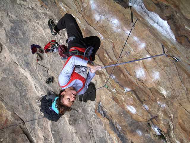
{% include '@bolt-components-image/image.twig' with {
  src: "/images/placeholders/tout-4x3-climber.jpg",
  alt: "A Rock Climber",
  imageAttributes: classes,
} only %}
Usage
  {% include '@bolt-components-image/image.twig' with {
  src: "/src/images/turtle.jpg",
  alt: "A Turtle"
} only %}
Schema
| Name | Type | Value(s) | Description | Default |
|---|---|---|---|---|
| attributes | object
| |
A Drupal-style attributes object with extra attributes to append to this component. |
N/A |
| src | string
| |
Source url for image. |
N/A |
| alt | string
| |
Alt tag for image. |
N/A |
| lazyload | boolean
|
|
Lazyload can boost performance by loading images on demand, instead of on initial page load. |
true
|
| no_lazy | boolean
|
|
Override the default lazyload behavior. Used only on the web component, where the presence of a boolean property always equates to |
false
|
| placeholder_color | string
| |
A valid CSS background color property shown while image loads. |
hsl(233, 33%, 97%)
|
| placeholder_image | string
| |
Image path or image data shown while image loads. |
data:image/gif;base64,R0lGODlhAQABAAAAACH5BAEKAAEALAAAAAABAAEAAAICTAEAOw==
|
| srcset | string
| |
A comma seperated string of image urls and image widths, used for optimizing image loading performance. |
N/A |
| sizes | string
| |
A list of one or more strings separated by commas indicating a set of source sizes. Each source size consists of a media condition (omitted for the last item), and a source size value. Learn more. |
auto
|
| useAspectRatio | boolean
|
|
DEPRECATED Use the |
true
|
| ratio |
string OR boolean |
|
boolean option is DEPRECATED Set the aspect ratio for the image via slash-separated width and height values, e.g. 4/3. Currently required for aspect ratio to be applied properly. Set to "none" to opt out of aspect ratio. |
auto
|
| width |
number OR string |
|
DEPRECATED Override the default width of the image. If no height is provided, aspect ratio will be maintained. |
N/A |
| height |
number OR string |
|
DEPRECATED Override the default height of the image. If no width is provided, aspect ratio will be maintained. |
N/A |
| cover | boolean
|
|
Set an image to fill its container. |
false
|
| imageAttributes | object
| |
DEPRECATED A Drupal-style attributes object with extra attributes to append to this component. |
N/A |


